Choropleth map
Written by
Updated at January 18, 2024
A choropleth map uses different colors or shades to display entire areas and regions. Areas on a map are set using geopolygons. A geopolygon is an element that consists of an area bounded by a close line and the line itself. The value of a measure is indicated through the intensity of color or its shade.
To show polygons on a map, add a Geopolygon type field to your dataset:
- Create a text field with data like
[[[55.60807, 37.5698], [55.60847, 37.56992], [55.60851, 37.57095]]], with polygon point coordinates enclosed in square brackets. You can first prepare data in a database and set the Geopolygon data type in the dataset description interface. - Use the
GEOPOLYGON(polygon_string)function to create a calculated field with the Geopolygon data type. - If your data contains a field with a city, region, or country name, use the geopoint/geopolygon reference from Geointellect, a partner of Yandex.
Follow the link to download a sample CSV file with Russian region polygons.
A choropleth map is used for estimating the value of a measure within a territorial unit. For example, you can use a choropleth map to show the population density of individual districts.
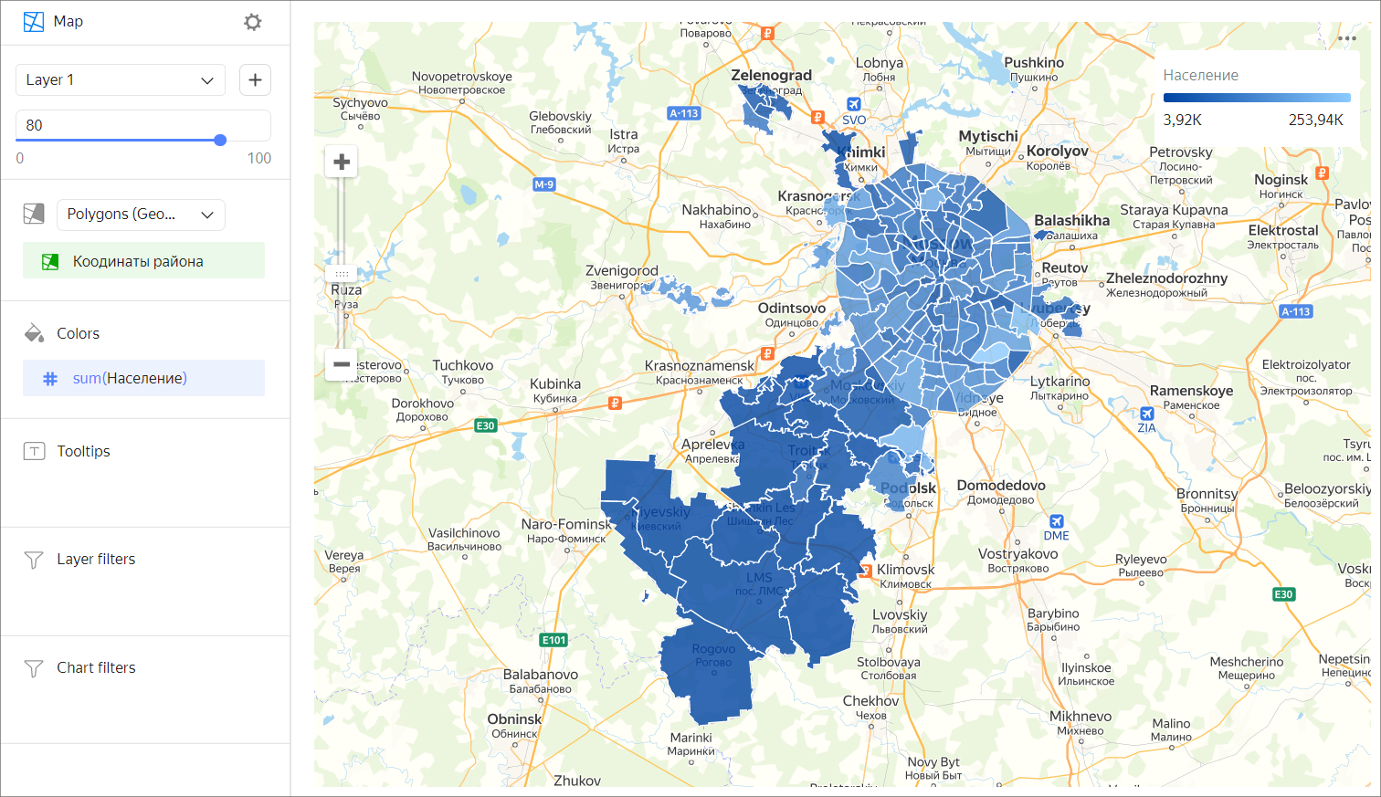
Wizard sections
| Wizard section | Description |
|---|---|
| Polygons (Geopolygons) | Measure with the type Geopolygon. |
| Colors | Dimension or measure. Affects the color and intensity of area fill. |
| Tooltips | Dimension or measure. A tooltip that appears when you hover over an area. |
| Layer filters | Dimension or measure. Used as a filter for the current layer. |
| Filters | Dimension or measure. Used as a filter for the entire chart. |
Creating a choropleth map
- On the Yandex DataLens home page, click Create chart.
- Under Dataset, select a dataset for visualization. If you do not have a dataset, create one.
- Select the Map chart type.
- Select Polygons (Geopolygons) as the layer type.
- Drag a dimension with the Geopolygon type from the dataset to the layer type selection section.
- Color the polygons on the map. Move the measure or dimension to the Colors section.
- Add tooltips to show the dimension and measure values when hovering over a polygon.
You can also:
- Add, rename, and delete a layer.
- Apply a filter to the whole chart or one layer.
Recommendations
- Don't use a choropleth map to precisely compare some values.
- To make it more precise, add data signatures or tooltips with information to the map.