Analyzing public data on road accidents in Russia
- Getting started
- Step 1. Create a connection to a CSV file
- Step 2. Create a dataset and configure its fields
- Step 3. Create your first chart: a heat map
- Step 4. Create your second chart: a bar chart
- Step 5. Create more charts: line charts
- Step 6. Create a dashboard
- Step 7. Add charts to the dashboard
- Step 8. Add selectors and create a dashboard
- Step 9. Add a table with region geolayers
- Step 10. Add new fields to the dataset
- Step 11. Create a chart using the new fields
- Step 12. Add a new chart to the dashboard
- Step 13. Publish the dashboard
This scenario analyzes public data on road accidents in Russia. In addition to identifying the facts of accident statistics in Russia, during the analysis you will learn how to:
- Work with the DataLens key entities: Connections, Datasets, Charts, and Dashboards.
- Combine multiple sources at the level of a single dataset.
- Use the
Date and timedata type and edit chart-level groupings. - Work with geodata: geopoints and geopolygons.
- Create public dashboards that will be available to everyone from any device without authentication.
To visualize and explore data, set up DataLens and follow the steps below:
- Create a connection to a CSV file.
- Create a dataset and configure its fields.
- Create your first chart: a heat map.
- Create your second chart: a bar chart.
- Create line charts.
- Create a dashboard.
- Add charts to the dashboard.
- Add selectors and create a dashboard.
- Connect an additional source with region geolayers.
- Add new fields to the dataset.
- Create a chart using the new fields.
- Add a new chart to the dashboard.
- Publish the dashboard.
Getting started
To get started with DataLens:
-
Log in to your Yandex account.
-
Open the DataLens home page.
-
Click Open Datalens.
-
Select one of the options:
-
If you already have an organization, select it from the drop-down menu in the Organizations tab and click Open DataLens.
Note
To activate a DataLens instance, the user must have the
adminorownerrole. For more information about roles, see Access management in Yandex Cloud Organization. -
If you have a cloud but no organization, click Add new DataLens. In the window that opens, enter your organization's name and description and click Create organization and DataLens. For more information about working with organizations, see Getting started with organizations.
-
If you have a technical question about the service, please contact Yandex Cloud support. To ask for advice, discuss the solution to your problem or best practices of the service, write to the DataLens chat in Telegram.
Step 1. Create a connection to a CSV file
-
Download the file with traffic accident statistics for April-December 2018 in CSV format.
-
Open the DataLens home page.
-
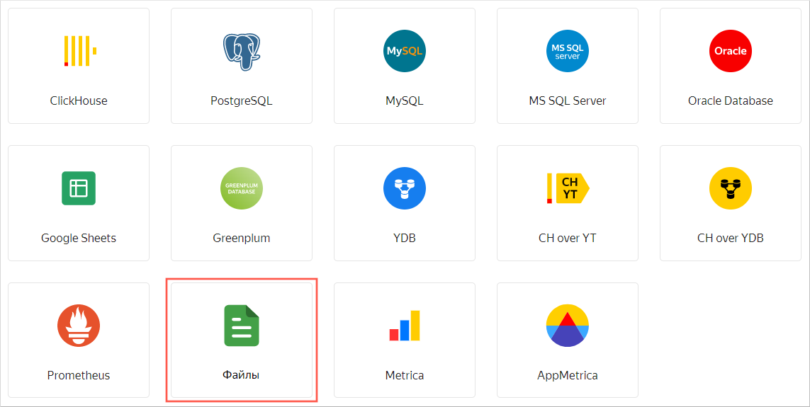
In the left-hand panel, select Connections and click Create connection.
-
Select the Files connection type.
-
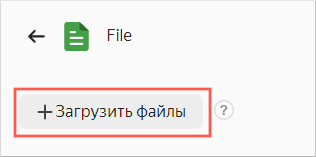
Click Upload files and select the downloaded file. It may take up to several minutes to load it, depending on the speed of your internet connection.
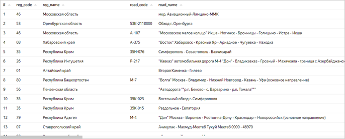
Once loading is compete, you will see a preview of the file data. To view it, use the scroll bars on the right and at the bottom.
-
In the top-right corner, click Create connection.
-
Enter the
dtp_dataconnection name and click Create.
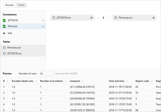
This will create the file connection. The data will be shown in the same form as in the file. To use it, you need to create a dataset.
Step 2. Create a dataset and configure its fields
The dataset will consist of a single source: the CSV file.
-
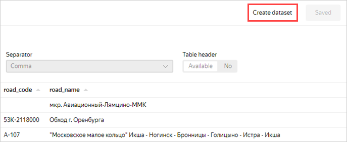
Click Create dataset.
-
Go to the Fields tab.
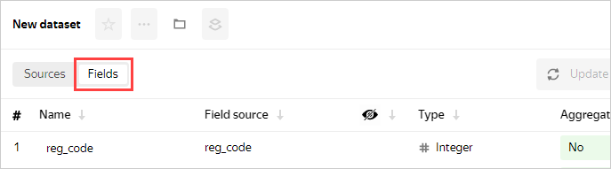
You can add data fields and calculated fields, change the field data type and aggregation rules, and rename fields.
-
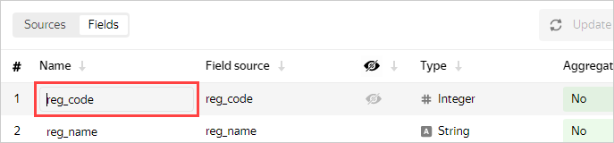
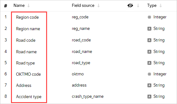
Change the field names to Russian ones in the following order:
- Region code
- Region name
- Road code
- Road name
- Road type
- OKTMO code
- Address
- Accident type
-
The accident date and time are shown in the following fields:
- crash_date: Date in numeric format, e.g.,
20190218 - crash_time: Time, e.g.,
19:34
They will not be used in the dataset in this format. Click the visibility icon to hide them.
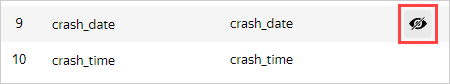
- crash_date: Date in numeric format, e.g.,
-
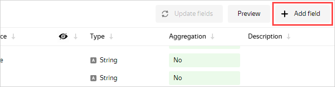
To display information about the accident date and time, add a new field.
-
Click Add field.
-
Specify the following data for it:
- Field name: Date and time
- Formula:
DATETIME_PARSE(str([crash_date])+' '+str([crash_time]))
Tip
To avoid errors, select fields for the formula from the list on the left instead of entering them manually.
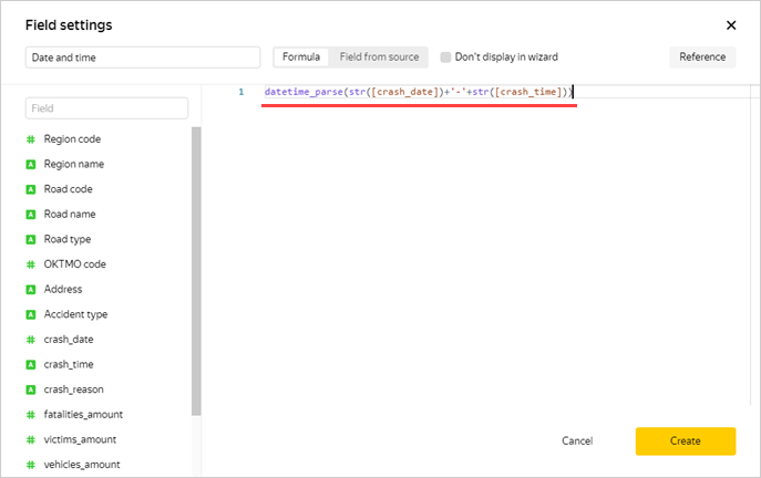
Tip
To review the documentation for these functions yourself, click Reference at the top right.
-
Click Create.
The preview section now correctly displays the accident date and time as a value of the
Date and timetype with the T separator. The new Date and time field is at the top of the table. Click to edit the field formula.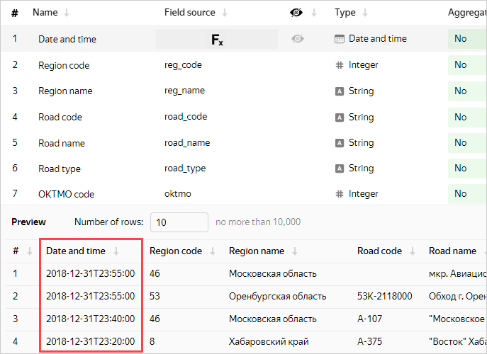
-
-
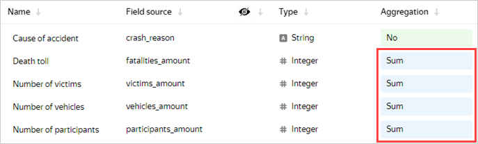
Continue renaming the fields in the following order:
- Cause of accident
- Death toll
- Number of victims
- Number of vehicles
- Number of participants
Set the Sum aggregation type for the following fields:
- Death toll
- Number of victims
- Number of vehicles
- Number of participants
-
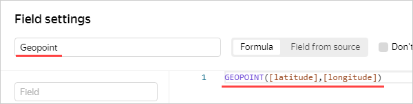
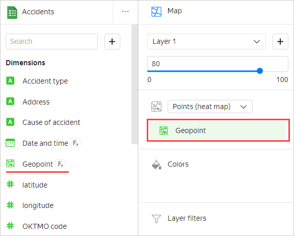
Add a field to display a geopoint.
-
Click Add field at the top right.
-
Enter data for the new field:
- Field name: Geopoint
- Formula:
GEOPOINT([latitude],[longitude])
where [latitude] and [longitude] are dataset fields.
-
Click Create.
Note
The example is based on ready-to-use data in coordinate format.
-
Make sure that the table and preview contain the new
Geopointtype field.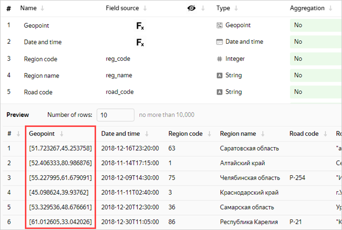
-
-
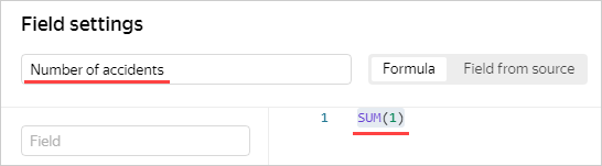
Add a field to display the number of accidents.
-
Click Add field.
-
Enter data for the new field:
- Field name: Number of accidents
- Formula:
SUM(1)
-
Click Create.
You do not need to set the aggregation type for this field: when you add it to the chart, DataLens applies the aggregation function automatically.
-
-
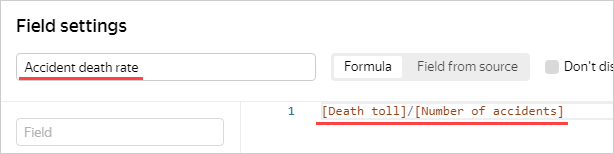
Add a field for data on deaths in road accidents.
-
Click Add field.
-
Enter data for the new field:
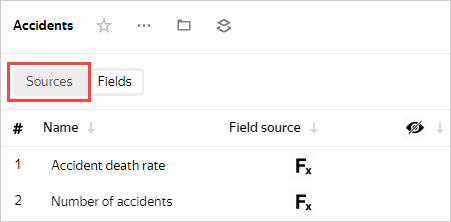
- Field name: Accident death rate
- Formula:
[Death toll]/[Number of accidents]
-
Click Create
Note
You can create calculated fields directly in charts. However, it is more convenient to do this at the dataset level to make them available in all charts.
-
-
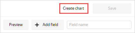
Save the dataset by clicking Save at the top right.
-
In the window that opens, specify the dataset name: Accidents. Click Create.
The dataset is created.
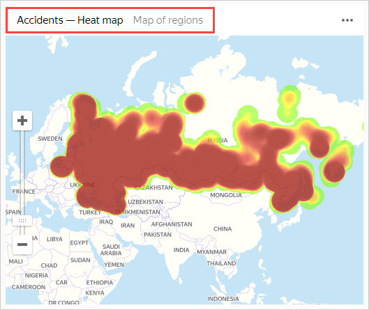
Step 3. Create your first chart: a heat map
Proceed to creating the first chart.
-
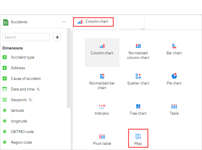
Click Create chart.
-
In the wizard window that opens, click the field that defaults to Bar chart and select the Map chart type.
-
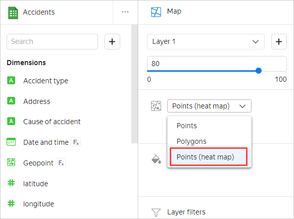
Under Points, select the Points (heat map) layer type.
-
Drag the Geopoint field to the Geopoints section.
That's your first chart on the map.
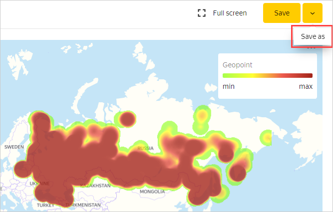
-
To save it, click the arrow icon next to the Save button and select Save as.
-
In the dialog box, name the chart Heat map and click Save.
Step 4. Create your second chart: a bar chart
-
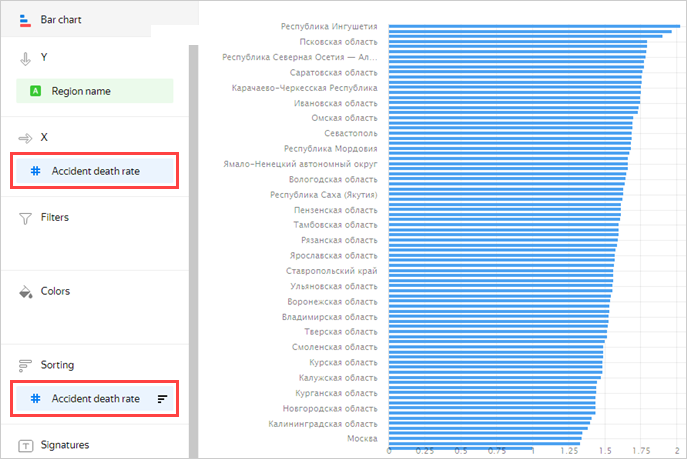
Analyze the number of accidents by region.
-
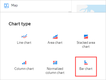
In the same window, select Bar chart as the chart type.
-
Drag:
- The Region name field to the Y section.
- The Number of accidents field to the X section.
- The Number of accidents field to the Sorting section.
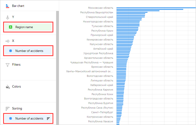
The chart shows the number of accidents by region. Most accidents occurred in the Moscow region.
Note
The legend may be missing for some of the chart lines. If this is the case, hover over the line and you will see a tooltip with the region name.
-
Click Save as to save the chart.
-
In the window that opens, name the chart Number of accidents by region and save it.
-
-
Analyze the death rate in accidents by region.
-
Replace the Number of accidents measure with Accident death rate by dragging and dropping.
This time, Ingushetia, Kalmykia, and the Volgograd region are far ahead in the number of deaths.
-
Save the chart by clicking Save as and name it Death rate by region.
-
Step 5. Create more charts: line charts
Let's see how the number of accidents and related deaths are distributed by week, day of the week, and time of day.
-
Analyze the number of accidents and death rate by week.
-
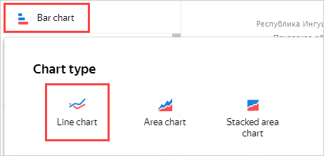
In the same window, select Line chart as the chart type.
-
The chart management sections contain the previous values. Delete them by clicking .
-
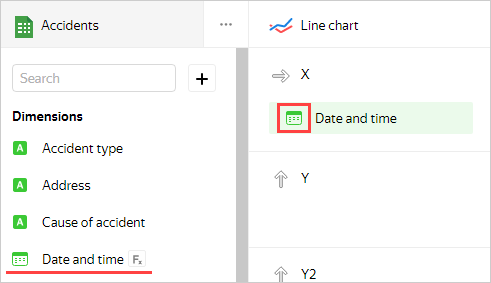
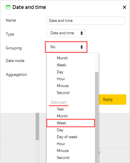
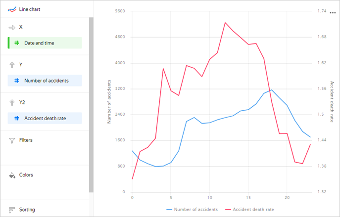
Drag the Date and time field to the X section and click the green calendar icon.
-
In the Grouping field, choose Date part ⟶ Week and click Apply.
-
Drag:
- The Number of accidents field to the Y section.
- The Accident death rate field to the Y2 section.
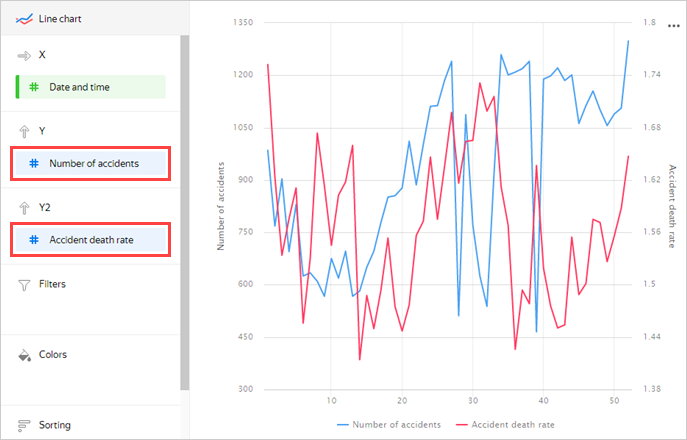
Now you can see a chart with two graphs: the number of accidents and death rate. If you hover over a point on the chart, a tooltip appears with specific values.
-
Save the chart by clicking Save as and name it Number of accidents and death rate by week.
-
-
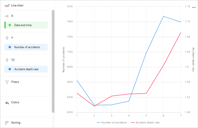
Now analyze the number of accidents and death rate by day of the week.
-
Change grouping by date and time to Date part ⟶ Day of week.
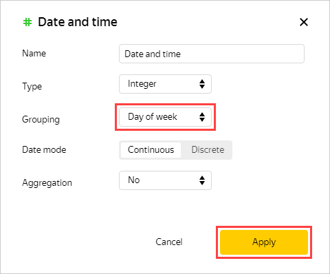
This chart shows more obvious trends.
-
Save the chart by clicking Save as and name it Number of accidents and death rate by day of week.
-
-
Analyze the number of accidents and death rate by hour of day.
-
Change grouping by date and time to Date part ⟶ Hour.
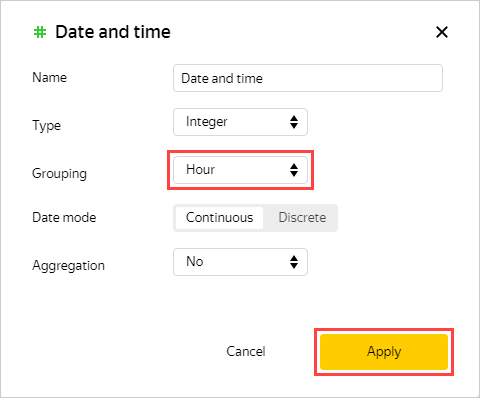
The chart shows that less accidents occur at night, but they result in more casualties.
-
Save the chart by clicking Save as and name it Number of accidents and death rate by hour of day.
-
Step 6. Create a dashboard
-
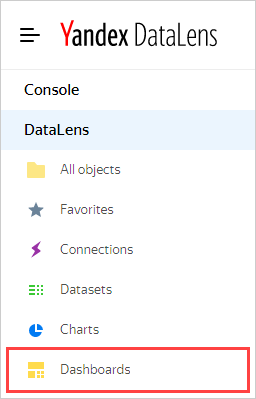
Open the menu by clicking the icon to the left of the logo and select Dashboards.
-
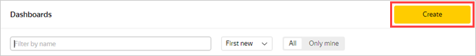
Click Create dashboard.
Step 7. Add charts to the dashboard
-
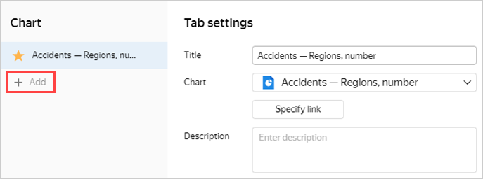
Add the first chart.
-
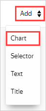
Click Add and select Chart from the drop-down list.
-
In the Chart field, click Select and select the previously created Heat Map chart from the chart list.
-
Click Add.
The chart is displayed on the dashboard.
-
-
Repeat the previous three steps for the Number of accidents by region, Number of accidents and death rate by week, Number of accidents and death rate by day of week, and Number of accidents and death rate by hour of day charts by adding them to the dashboard.
-
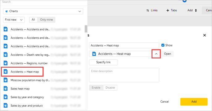
Create a switch for the Number of accidents by region and Death rate by region charts on the dashboard.
-
Click the Number of accidents by region chart settings icon to open them.
-
Click Add to the left of the screen.
-
In the Chart field, click Select and choose the Death rate by region chart.
-
Click Save.
-
Step 8. Add selectors and create a dashboard
Selectors allow you to filter data by value.
-
Add a selector to show statistics by region name.
-
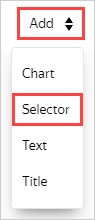
Click Add and choose Selector.
-
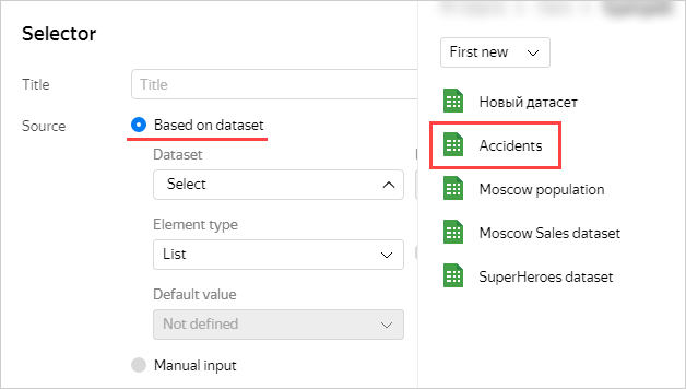
Select Based on dataset, click Select, and choose the previously created Accidents dataset.
-
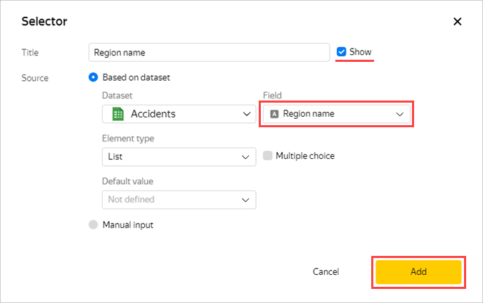
In the Field property, choose Region name and select Show next to the selector name. Click Add.
The selector will be displayed on the dashboard as a rectangle.
-
-
Repeat the previous three steps for the fields:
- Cause of accident
- Accident type
- Road type
- Road name
-
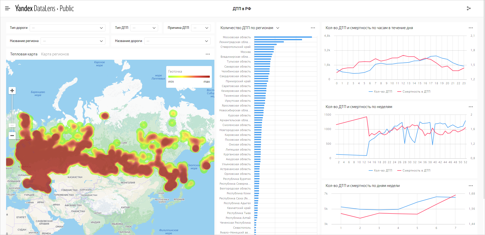
You can drag and resize dashboard elements. Place the elements according to the screenshot or however is convenient for you and save the dashboard:
- In the top-right corner of the dashboard, click Save.
- Name the dashboard Accidents in Russia and click Create.
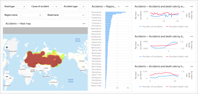
If you choose any values in the selectors, the charts will display data for these values.
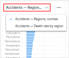
You can switch the Number of accidents by region chart to Death rate by region.
Step 9. Add a table with region geolayers
Sometimes, heat maps are not very informative. Upload the polygon reference and add a chart with a color fill for Russian regions.
-
Download the Regions.csv file.
-
Open the
dtp_dataconnection. -
Click Upload files and select the downloaded file.
-
Take a look at a preview of the file data. For the Column header parameter, set the Yes value.
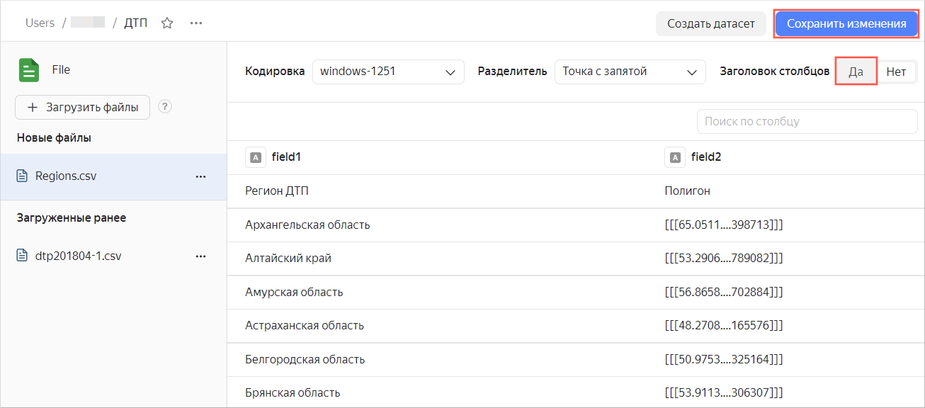
-
At the top right, click Save changes.
Step 10. Add new fields to the dataset
You need to add new fields to the previously created Accidents dataset.
-
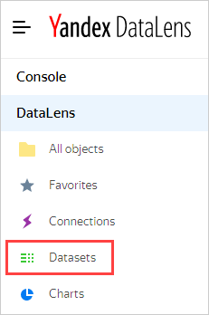
In the left menu, select Datasets.
-
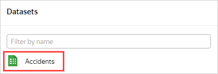
Choose the Accidents dataset.
-
Go to the Sources tab.
-
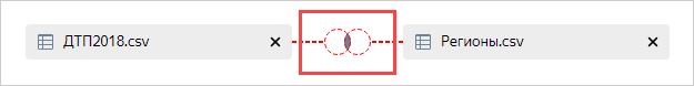
Drag the new table Regions.csv to the editing area.
Since the charts data has not yet been merged, an error message may appear. Follow these steps:
-
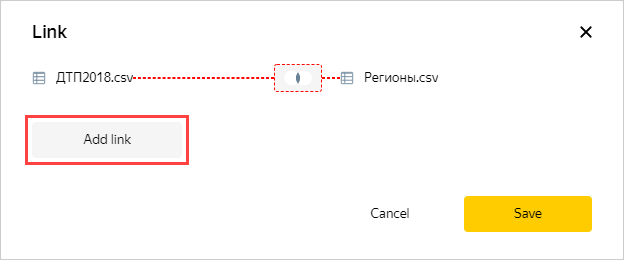
Click the merge data icon.
-
Click Add link.
-
Select the fields to link: reg_name and Accident region. Then click Apply.
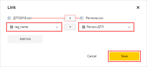
Make sure the data preview is displayed correctly.
-
Go to the Fields tab.
-
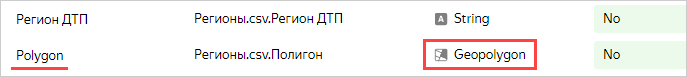
New fields are displayed at the bottom of the list. For the Polygon field, specify the Geopolygon data type.
-
In the top-right corner, click Save.
Step 11. Create a chart using the new fields
-
Click Create chart.
-
Select the Map chart type.
-
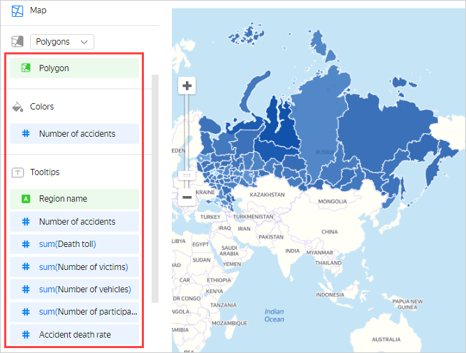
Add polygons to the map. Drag the Polygon field from Dimensions to the Geopolygons section.
-
Change colors of the polygons based on the number of accidents. Drag the Number of accidents field from Measures to the Colors section.
-
Drag the following fields to the Tooltips section:
- Region name
- Number of accidents
- Death toll
- Number of victims
- Number of vehicles
- Number of participants
- Accident death rate
The chart shows a map with a color fill for regions. If you hover over a region, information for that region appears.
-
In the top-right corner, click Save.
-
Name the chart Map of regions and click Save once again.
Step 12. Add a new chart to the dashboard
-
Select Dashboards in the top-left menu.
-
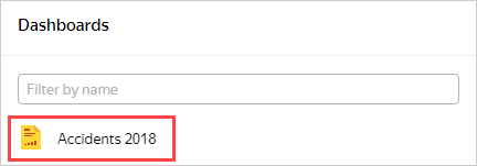
Select the previously created dashboard with accident data.
-
Click Edit at the top right.
-
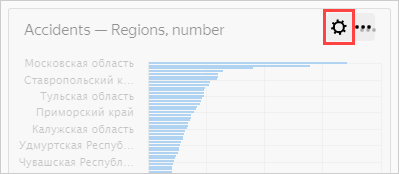
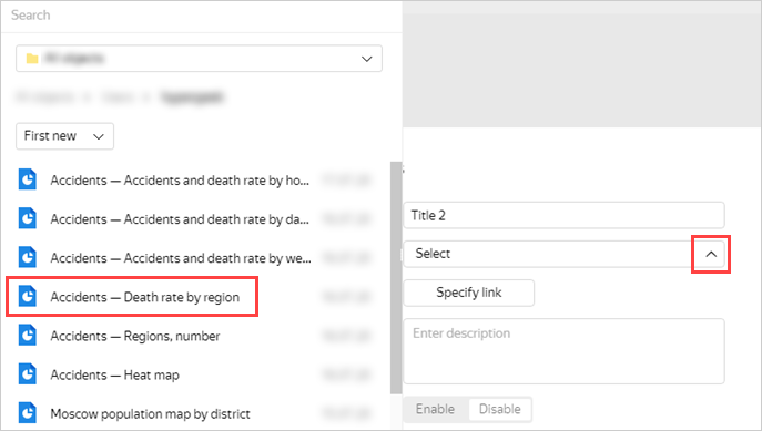
Click the Heat map settings icon to open them.
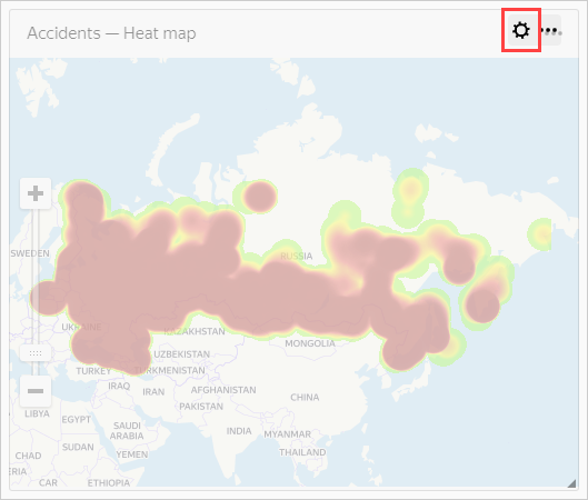
-
Click Add to the left of the screen.
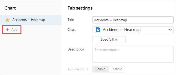
-
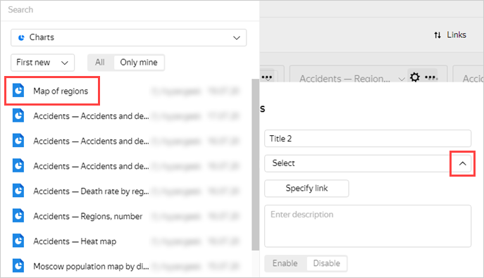
In the Chart field, click Select and choose the last chart named Map of regions.
-
Click Save.
You can now switch the type of map data visualization: heat map or region fill.
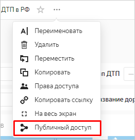
Step 13. Publish the dashboard
To configure public access to the dashboard:
-
In the top-left corner, click .
-
Select Public access in the drop-down menu.
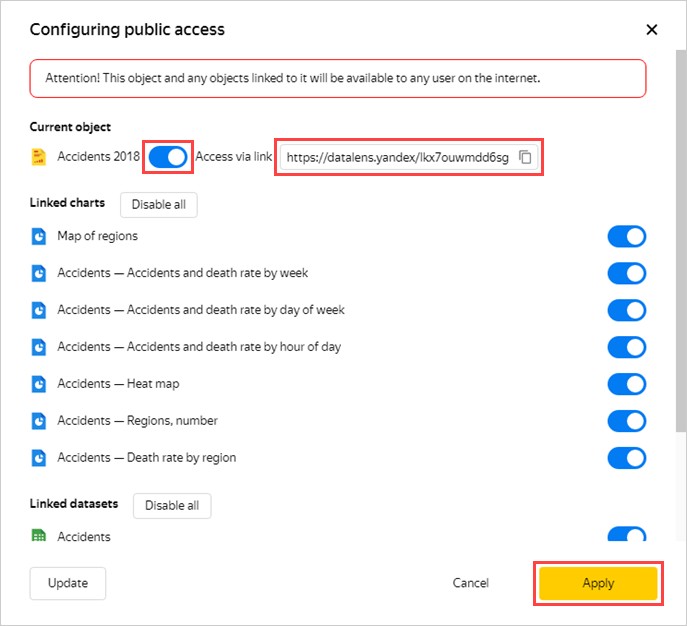
-
Enable access via link. You can copy and share the link that appears. Everyone can use the link to access the dashboard from any device and without authentication. Click Apply.
Note
You can enable or disable public access separately for each chart and dataset associated with the dashboard.
The dashboard is published and available to users.