Visualizing data from a file
- Getting started
- Step 1. Create a connection and dataset
- Step 2. Create a dataset
- Step 3. Create the first chart
- Step 4. Create the second chart
- Step 5. Create a dashboard
- Step 6. Add charts to the dashboard
- Step 7. Add selectors to the dashboard
- Step 8. Set up widgets and start analyzing dependencies
- Step 9. Continue to analyze the data about superheroes
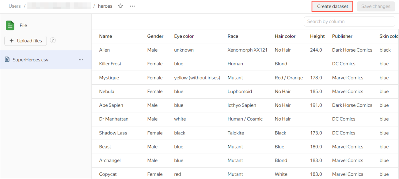
For our source data, let's use a file named SuperHeroes.csv with information about superheroes, such as their name, gender, race, and comic book publisher.
This scenario demonstrates how to use DataLens to analyze dependencies, for example:
- A superhero's weight from their gender.
- A superhero's weight from whether they're good or bad.
To visualize and explore data, set up DataLens and follow the steps below:
- Create a connection.
- Create a dataset.
- Create the first chart.
- Create the second chart.
- Create a dashboard.
- Add charts to the dashboard.
- Add selectors to the dashboard.
- Set up widgets and start analyzing dependencies.
- Continue to analyze the data about superheroes.
Getting started
To get started with DataLens:
-
Log in to your Yandex account.
-
Open the DataLens home page.
-
Click Open Datalens.
-
Select one of the options:
-
If you already have an organization, select it from the drop-down menu in the Organizations tab and click Open DataLens.
Note
To activate a DataLens instance, the user must have the
adminorownerrole. For more information about roles, see Access management in Yandex Cloud Organization. -
If you have a cloud but no organization, click Add new DataLens. In the window that opens, enter your organization's name and description and click Create organization and DataLens. For more information about working with organizations, see Getting started with organizations.
-
If you have a technical question about the service, please contact Yandex Cloud support. To ask for advice, discuss the solution to your problem or best practices of the service, write to the DataLens chat in Telegram.
Step 1. Create a connection and dataset
Create a dataset based on the Files connection type.
-
Go to the DataLens home page.
-
In the left-hand panel, select Connections and click Create connection.
-
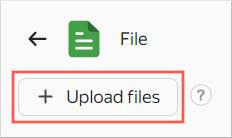
Select Files.
-
Click Upload files.
-
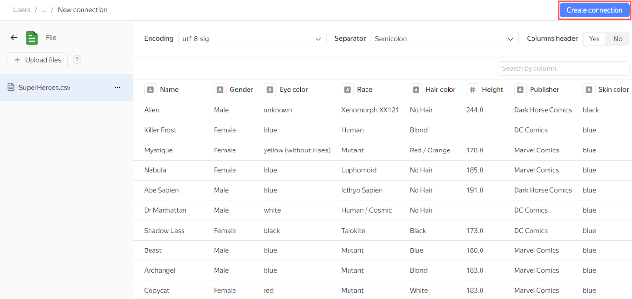
Select the file. For this example, use SuperHeroes.csv (download link).
Wait until the table content appears on the screen.
-
Click Create connection.
-
Enter the
SuperHeroesconnection name and click Create.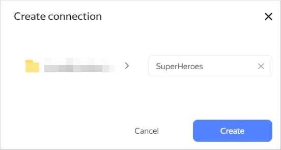
-
After the data is saved, click Create dataset.
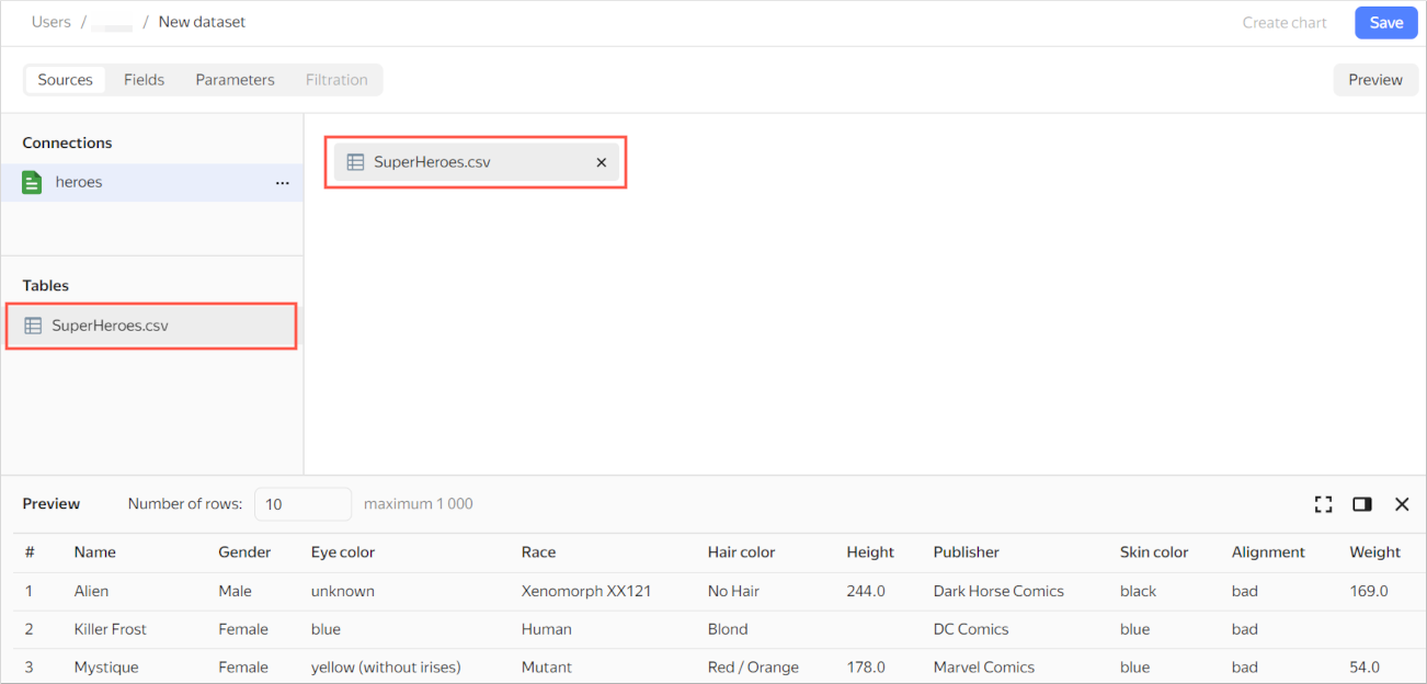
Step 2. Create a dataset
-
If there is no SuperHeroes.csv table in the workspace, drag the table from the selection panel to the workspace.
-
Go to the Fields tab.
-
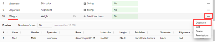
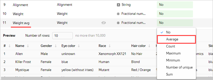
Create a field for the superheros's average weight:
-
Click in the Weight row.
-
Select Duplicate.
-
Rename the Weight (1) duplicate field to Weight avg: click the row name, delete the current name, and enter the new one.
-
In the Aggregation column, select Average for the Weight avg field.
-
-
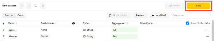
In the top-right corner, click Save.
-
Enter a name for the dataset: SuperHeroes dataset, then click Create.
-
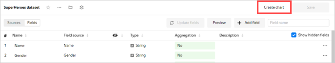
When the dataset is saved, click Create chart.
Step 3. Create the first chart
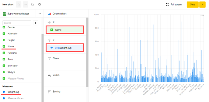
To visualize data by gender, create a bar chart type chart.
-
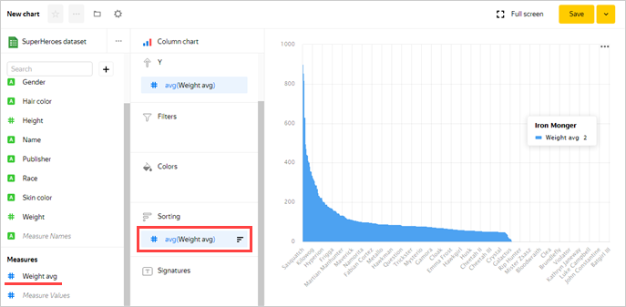
Add the names of superheroes to the chart. To do this, drag the Name field from Dimensions to the X section.
-
Add the superheroes' weight to the chart. To do this, drag the Weight avg field from Measures to the Y section.
-
Sort the chart by weight, e.g., in descending order.
-
From the first column in Measures, drag the Weight avg field to the Sorting section.
-
-
Leave only the superheroes whose weight is known (greater than zero) on the chart.
-
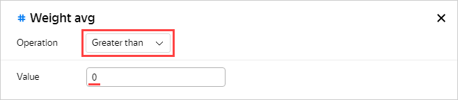
From the first column in Measures, drag the Weight avg field to the Filters section.
-
In the window that opens, specify the Greater than operator and the 0 value.
-
Click Apply filter.
-
-
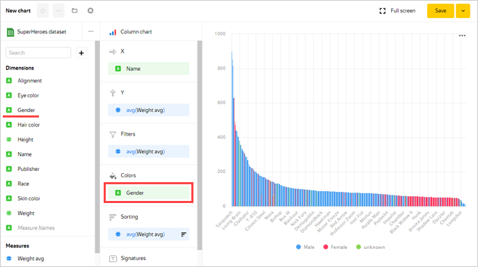
Add a color division for superheroes depending on their gender to the chart. To do this, drag the Gender field from Dimensions to the Colors section.
-
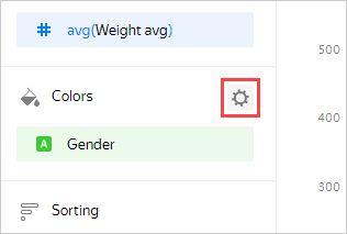
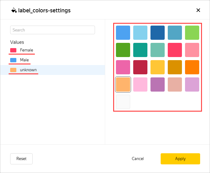
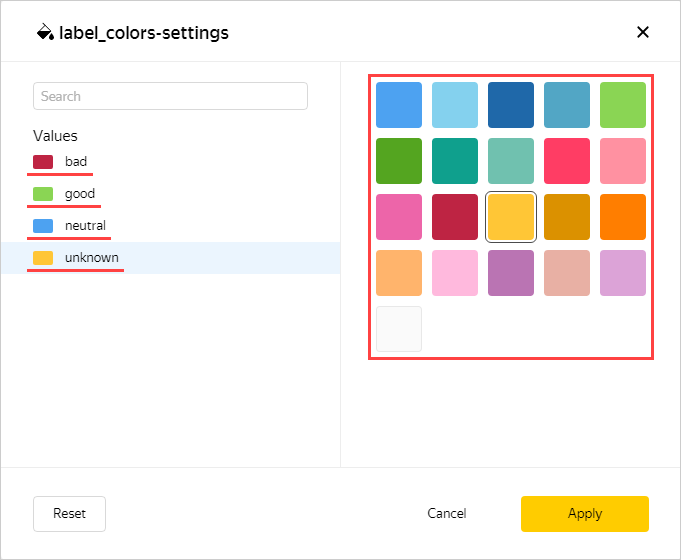
Redefine the colors for the Gender dimension.
-
Click the settings icon in the Colors section.
-
Select the colors: pink for Female; blue for Male; orange for unknown.
-
-
Save the chart.
-
In the top-right corner, click Save.
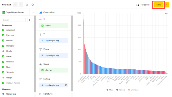
-
In the window that opens, enter a name for the chart: SuperHeroes — gender, then click Save.
-
Step 4. Create the second chart
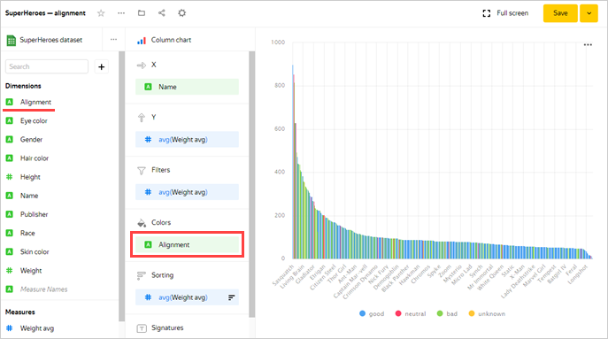
To visualize whether a superhero is good or bad, create a bar chart.
-
Copy the chart from the previous step.
-
Click the down arrow next to the Save button in the top-right corner.
-
Click Save as.
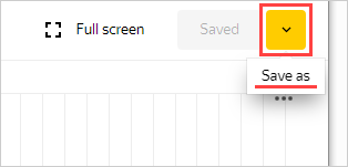
-
In the window that opens, enter the name of the new chart: SuperHeroes — alignment.
-
Click Done.
-
-
Add to the chart a color division for superheroes depending on whether they are good or bad. To do this, drag the Alignment field from Dimensions to the Colors section.
The previous value of the section (the Gender field) is replaced with Alignment.
-
Redefine the colors for the Alignment dimension.
-
Click the settings icon in the Colors section.
-
Select the colors: green for good; blue for neutral; red for bad; orange for unknown.
-
-
In the top-right corner, click Save.
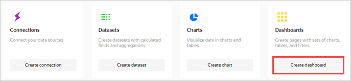
Step 5. Create a dashboard
Create a dashboard to add these charts to.
-
Go to the DataLens home page.
-
Click Create dashboard.
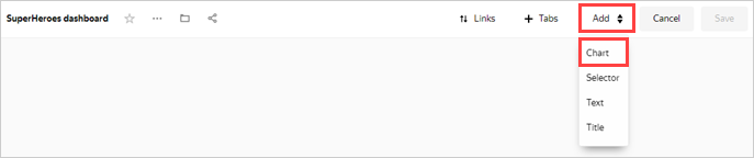
Step 6. Add charts to the dashboard
-
The first time you open the dashboard after saving, it opens in edit mode. If you open it later, click Edit in the top-right corner.

-
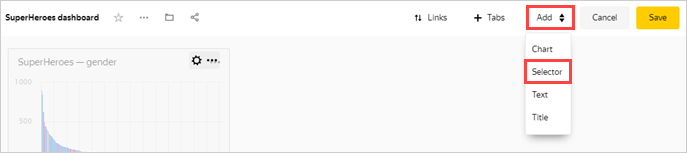
Click Add.
-
Choose Chart.
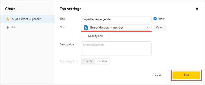
-
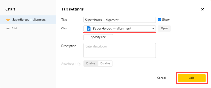
In the window that opens, click Select and choose the SuperHeroes — gender chart.
This will automatically fill in the Name field.
-
Click Add.
-
Add another chart. Perform step 6 from the beginning and specify the SuperHeroes — alignment chart in item 4.
Step 7. Add selectors to the dashboard
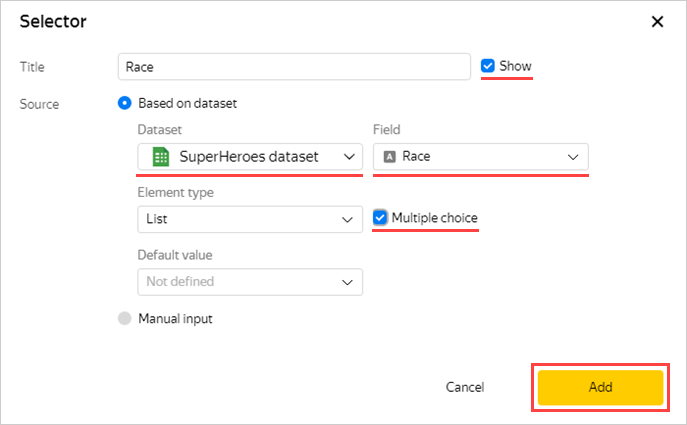
Add selectors to be able to filter superheroes by race (the Race field) and publisher (the Publisher field).
-
Click Add.
-
Choose Selector.
-
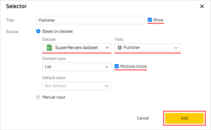
Select the SuperHeroes dataset.
-
Select the Race field.
This will automatically fill in the Name field.
-
Click the Show checkbox next to the selector title.
-
Enable the Multiple choice option.
-
Click Add.
-
Add another selector. Perform step 7 from the beginning and specify the Publisher field in item 4.
Step 8. Set up widgets and start analyzing dependencies
-
Drag the selectors to the top of the page next to each other.
-
Stretch the charts by width and place them next to each other.
-
In the top-right corner, click Save.
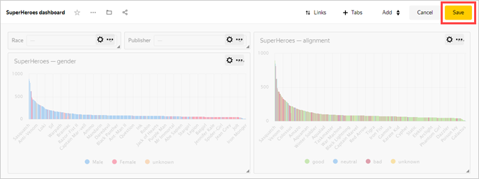
-
Enter SuperHeroes dashboard for the dashboard name and click Create.
-
Apply various filters and analyze the weight dependencies on a superhero's gender and good or bad alignment.
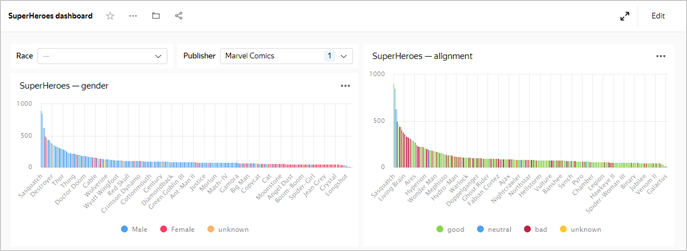
The dataset analyzed shows the following dependencies:
- Men are generally heavier than women.
- Bad superheroes are mostly heavier than good ones.
Step 9. Continue to analyze the data about superheroes
You can create new measures in the dataset, such as average height (average from the Height field) and the number of superheroes (number of unique entries from the Name field) and answer the following questions:
- Representatives of which race are the most numerous?
- Does a superhero's height depend on whether they are good or bad?
- Which studio created the most superheroes?