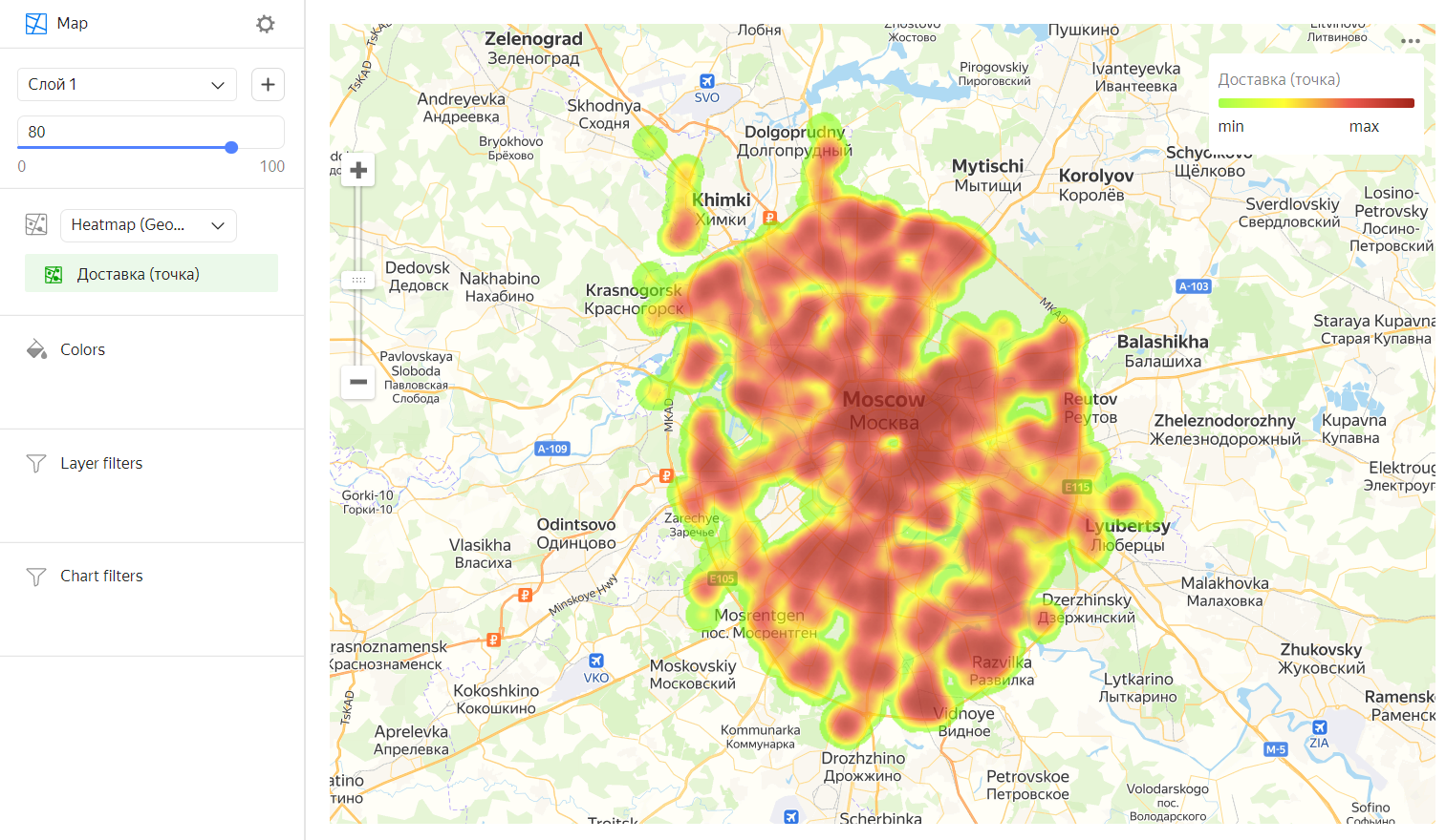
Heat map
A heat map shows the density of point distribution. Map areas are colored with a gradient ranging from green to red: the more points are grouped in an area, the closer its color is to red. Heat maps are used to display concentrations of a large number of points.
A heat map is most effective when working with a dataset that contains a lot of points located within a small geographic area. If there are few points on a map, their fill intensity can be indicated by a measure value: the higher the value, the closer the point color to red.
A heat map helps find dependencies that can be hidden due to overlapping map points (like on a point map). For example, you can use a heat map to determine the districts where customers order for delivery most often.
Sections in the wizard
| Section in the wizard |
Description |
|---|---|
| Heat map (Geopoints) | Measure with the type Geopoint. |
| Colors | Dimension or measure. Affects the intensity of point fill. |
| Layer filters | Dimension or measure. Used as a filter for the current layer. |
| Filters | Dimension or measure. Used as a filter for the entire chart. |
Creating a heat map
- On the Yandex DataLens home page, click Create chart.
- Under Dataset, select a dataset for visualization. If you do not have a dataset, create one.
- Select the Map chart type.
- Select the Heat map (Geopoints) layer type.
- Drag a dimension with the Geopoint type from the dataset to the layer type selection section.
- Change the weight of the points on the heat map. To do this, drag the measure to the Colors section.
You can also:
- Add, rename, and delete a layer.
- Apply a filter to the whole chart or one layer.
Recommendations
- Use a heat map if there are a lot of points in your dataset. If there are few points, using this type of map may distort the detected dependencies.
- The intensity of point and area fill on a heat map varies depending on the map's scale. Please keep this in mind.