Normalized column chart

A normalized column chart shows the contribution of each measure or category to the total amount. Unlike a stacked column chart, the proportion of segment ratios and not the total column length is important for this type of chart. Segments are highlighted in different colors and located one above the other. The height of a segment indicates its ratio to the total amount represented as 100%. For example, the percentage of sales for different product categories.
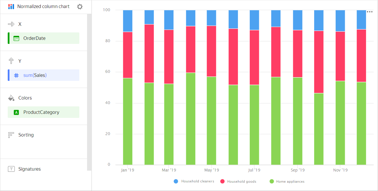
| Month | Home appliances | Household goods | Household cleaners |
|---|---|---|---|
| January 2019 | 128K | 55K | 26K |
| February 2019 | 97K | 79K | 18K |
| March 2019 | 187K | 105K | 41K |
| April 2019 | 188K | 137K | 34K |
| May 2019 | 230K | 121K | 43K |
| June 2019 | 256K | 162K | 59K |
| July 2019 | 284K | 206K | 67K |
| August 2019 | 409K | 204K | 72K |
| September 2019 | 314K | 209K | 86K |
| October 2019 | 324K | 262K | 79K |
| November 2019 | 385K | 238K | 101K |
| December 2019 | 451K | 307K | 111K |
This type of chart is used to see the contribution of each measure to the total value by period or category. For example, to view the percentage of different expenses in the total budget amount.
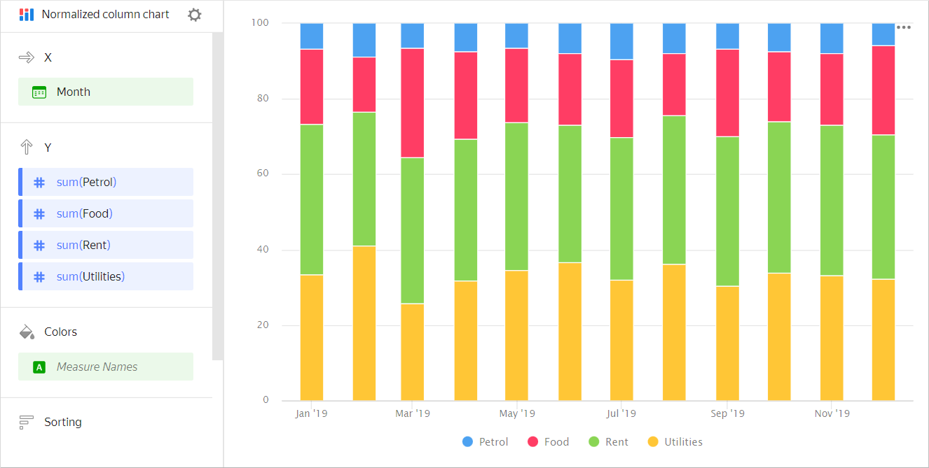
| Month | Gasoline | Rent | Food | Utility bills |
|---|---|---|---|---|
| January 2019 | 100 | 600 | 300 | 500 |
| February 2019 | 150 | 600 | 250 | 700 |
| March 2019 | 100 | 600 | 450 | 400 |
| April 2019 | 120 | 600 | 370 | 510 |
| May 2019 | 100 | 600 | 300 | 530 |
| June 2019 | 130 | 600 | 310 | 600 |
| July 2019 | 150 | 600 | 330 | 510 |
| August 2019 | 120 | 600 | 250 | 550 |
| September 2019 | 110 | 650 | 380 | 500 |
| October 2019 | 120 | 650 | 300 | 550 |
| November 2019 | 130 | 650 | 310 | 540 |
| December 2019 | 100 | 650 | 400 | 550 |
Sections in the wizard
| Wizard section | Description |
|---|---|
| X | Dimensions. You can specify one or two dimensions. |
| Y | Measure. You can specify multiple measures. If you add more than one measure to a section, the Colors section will contain a dimension named Measure Names. Measure Names can be moved to the X-axis. |
| Colors | Measure Names dimension or field that affects the color of lines. To remove Measure Names, delete measures from the Y axis. |
| Sorting | Dimension or measure. Affects the column sorting. The sorting direction is marked with an icon next to the field: ascending or descending. To change the sorting direction, click the icon. |
| Labels | Measure. Displays measure values on the chart. If multiple measures are added to the Y section, drag Measure Values to this section. |
| Split | Dimension. Splits a chart horizontally by the selected dimension's values. The maximum number of splits per chart is 25. |
| Filters | Dimension or measure. Used as a filter. |
Creating a normalized column chart
To create a normalized column chart:
- On the Yandex DataLens home page, click Create chart.
- Under Dataset, select a dataset for visualization.
- Select Normalized column chart as the chart type.
- Drag a dimension from the dataset to the X section. The values will be displayed in the lower part of the chart on the X axis.
- Drag one or more measures from the dataset to the Y section. The values are displayed as columns on the Y-axis.
- Drag a dimension from the dataset to the Color section. Columns are grouped into segments.
Recommendations
-
If the values of the categories contain a large amount of text, try to reduce it. Then the signatures on the diagram will look more accurate. You can use string functions in the calculated fields or conditional operators CASE.
-
Do not display more than three to five segments on the chart.
-
Place segments so that the largest or most important categories are located closer to the chart base. This makes it easier to compare the values.
-
You can split a chart by dimension into a number of small charts that are convenient to compare to one another. To do this, drag a dimension from the dataset to the Split section.
Chart example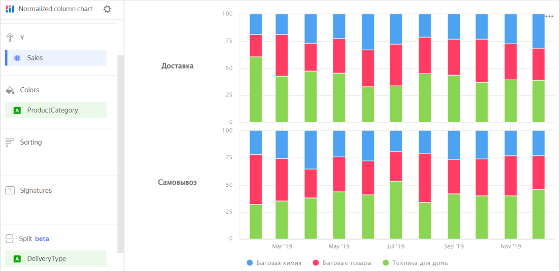
-
To display the absolute values of variables, use a column chart.