Pivot table
A table is a standard form of data representation with as many details as possible. Tables are most suitable for detailed analysis (a deep dive into figures) and problem detection. It is best to place tables at the end of a dashboard. Graphical representations are simpler for reading information, while tables take you deeper into the data and require more time to read.
Unlike a flat table, categories in a pivot table can be stored both in columns and rows. They may contain multiple categories, while cells at their intersection contain measure values.
Pivot tables make it easier to work with large amounts of data and let you analyze the relationship between different measures. For example, you can use this type of table to analyze product sales depending on the delivery type by brand and product category over a specific year.
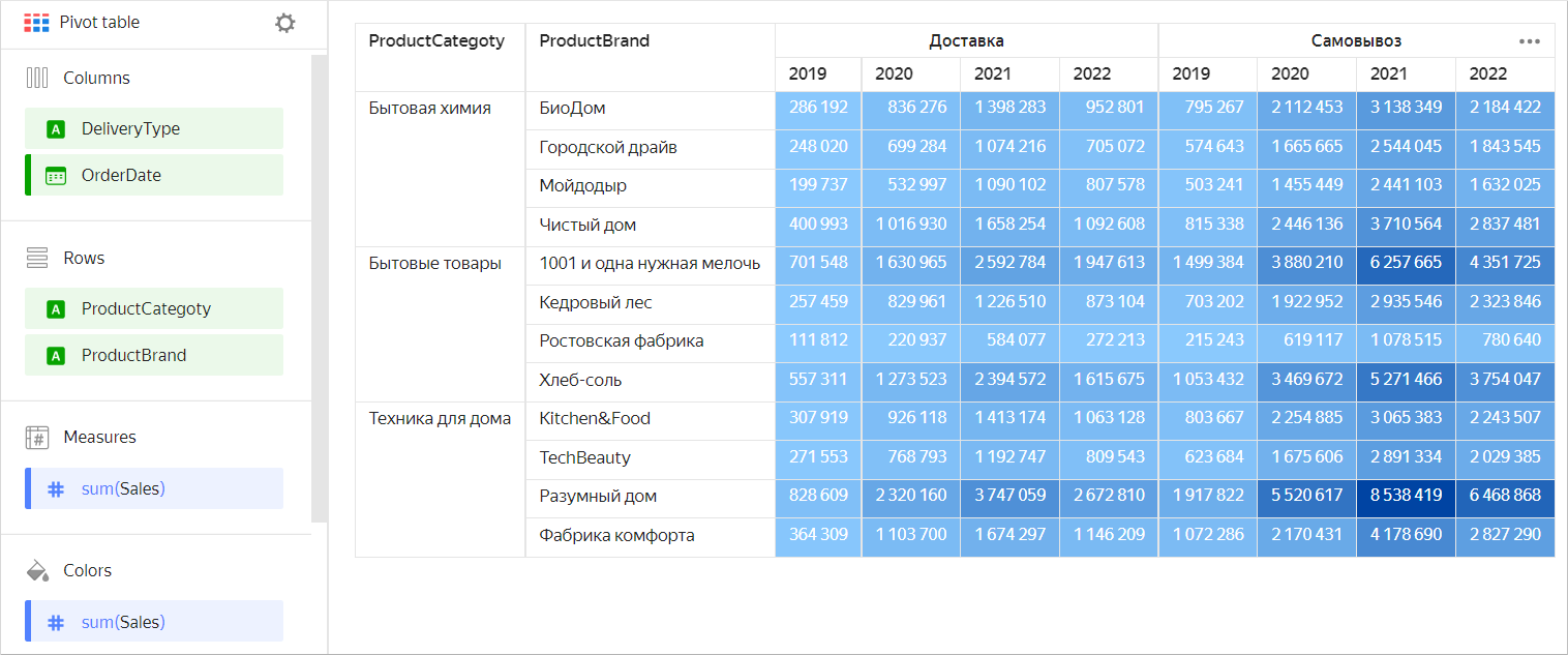
| Categories | Product brand | Delivery type | 2019 | 2020 | 2021 | 2022 |
|---|---|---|---|---|---|---|
| Household cleaners | BioDom | Delivery | 286192 | 836276 | 1398283 | 952801 |
| Household cleaners | City Driver | Delivery | 248020 | 699284 | 1074216 | 705072 |
| Household cleaners | Moydodyr | Delivery | 199737 | 532997 | 1090102 | 807578 |
| Household cleaners | Chistyy Dom | Delivery | 400993 | 1016930 | 1658254 | 1092608 |
| Household cleaners | BioDom | Pickup | 795267 | 2112453 | 3138349 | 2184422 |
| Household cleaners | City Driver | Pickup | 574643 | 1665665 | 2544045 | 1843545 |
| Household cleaners | Moydodyr | Pickup | 503241 | 1455449 | 2441103 | 1632025 |
| Household cleaners | Chistyy Dom | Pickup | 815338 | 2446136 | 3710564 | 2837481 |
| Household goods | 1001 necessary small things | Delivery | 701548 | 1630965 | 2592784 | 1947613 |
| Household goods | Cedar wood | Delivery | 257459 | 829961 | 1226510 | 873104 |
| Household goods | Rostov factory | Delivery | 111812 | 220937 | 584077 | 272213 |
| Household goods | Hleb-Sol | Delivery | 557311 | 1273523 | 2394572 | 1615675 |
| Household goods | 1001 necessary small things | Pickup | 1499384 | 3880210 | 6257665 | 4351725 |
| Household goods | Cedar wood | Pickup | 703202 | 1922952 | 2935546 | 2323846 |
| Household goods | Rostov factory | Pickup | 215243 | 619117 | 1078515 | 780640 |
| Household goods | Hleb-Sol | Pickup | 1053432 | 3469672 | 5271466 | 3754047 |
| Home appliances | Kitchen&Food | Delivery | 307919 | 926118 | 1413174 | 1063128 |
| Home appliances | TechBeauty | Delivery | 271553 | 768793 | 1192747 | 809543 |
| Home appliances | Razumnyy Dom | Delivery | 828609 | 2320160 | 3747059 | 2672810 |
| Home appliances | Fabrika Komforta | Delivery | 364309 | 1103700 | 1674297 | 1146209 |
| Home appliances | Kitchen&Food | Pickup | 803667 | 2254885 | 3065383 | 2243507 |
| Home appliances | TechBeauty | Pickup | 623684 | 1675606 | 2891334 | 2029385 |
| Home appliances | Razumnyy Dom | Pickup | 1917822 | 5520617 | 8538419 | 6468868 |
| Home appliances | Fabrika Komforta | Pickup | 1072286 | 2170431 | 4178690 | 2827290 |
Sections in the wizard
| Wizard section |
Description |
|---|---|
| Columns | Dimensions |
| Strings | Dimensions |
| Measures | Measures. If you add more than one measure to a section, the Columns section contains the Measure Names dimension that defines the location of the measure headers. Measure Names can be moved to Rows. |
| Colors | Measure. Affects shading of all cells containing indicators. It may only contain one measure. |
| Sorting | Dimensions and measures specified in the Columns and Rows sections. You can use multiple dimensions and measures. The order of section fields affects the sorting order of table fields. The sorting direction is marked with an icon next to the field: ascending or descending. To change the sorting direction, click the icon. Sorting by measure only impacts a request to the source and does not affect the pivot table. |
| Filters | Dimension or measure. Used as a filter. |
Creating a pivot table
Note
Not supported in QL charts.
To create a pivot table:
-
On the Yandex DataLens home page, click Create chart.
-
Under Dataset, select a dataset for visualization.
-
Select the Pivot table chart type.
-
Drag a dimension from the dataset to the Columns section.
-
Drag a dimension from the dataset to the Rows section.
Note
In the Columns and Rows sections, you can change the order of dimensions by dragging them.
-
Drag a measure from the dataset to the Measures section. The values are displayed in the table cells.
-
Drag a measure from the dataset to the Color section. Cells with the measure are filled in with a color from the color gradient, depending on the measure value.
Additional settings
Renaming table columns and rows
- Under Columns or Rows, click the icon to the left of the dimension name.
- In the window that opens, change the Name field value and click Apply.
Setting up the width of table columns and rows
-
In the top-right corner of the Columns or Rows section, click (the icon appears when you hover over the section).
-
In the Column and row width window that opens, set up the width of columns and rows:
Auto: Automatic column/row width.%: Column/row width as a percentage of the table's total width.px: Column/row width in pixels.
The
%andpxoptions let you make a table cell break (by word). This may increase the number of rows in a cell.Note
The total width of a table always takes up 100% of available space regardless of the specified width of individual columns and rows.
-
Click Apply.
To set the width of any column to Auto, click Reset.
Adding rows with subtotals
- Under Columns or Rows, click the icon in front of the field name.
- In the field settings window, enable Sub-totals.
- Click Apply.
The table will show columns and/or rows with Total
To output the common Total row, enable Sub-totals in the settings for the first fields under Columns and Rows.
Note
- The Total row does not support filtering by measure. You can hide the Total row by dragging a measure to the Filters or Dashboard filters section.
- Calculations using LOD expressions, window functions, and time series functions may not work correctly in the row with totals.
Setting up a field fill color
-
Under Columns, Rows, or Measures, click the icon to the left of the field name.
-
In the window that opens, enable Column fill color.
-
In the By field list, select the field whose values the fill will be based on.
-
Set the Fill type:
Note
You can use the Palette type for dimensions and the Gradient type for measures.
For a dimensionFor a measure- Click the color scheme selection field and set a color for each dimension value.
- Click Apply.
-
Click the gradient selection field and set up:
-
Gradient type: Select two or three colors.
- Gradient color: Select a color palette for the gradient from the list.
- Gradient direction: Change the gradient direction using the icon.
-
Set threshold values: Set numeric thresholds for each color.
-
-
Click Apply.
-
Click Apply.
Adding a linear indicator to a column with a measure
-
Under Measures, click the icon to the left of the measure name.
-
In the window that opens, enable Linear indicator.
-
Specify the indicator settings:
- Fill type: Type of fill color for the indicator.
- Positive values: Indicator color for positive values.
- Negative values: Indicator color for negative values.
- Show labels: This option enables displaying measure values in a cell.
- Show in totals: This option enables displaying the indicator in cells with totals.
- Align: Left or right alignment of the indicator position in a column. Only applies if all numbers in a column are either positive or negative.
- Scale: Sets the indicator scale. If you set it manually, specify the min and max values. Make sure the min value is less than or equal to
0and the max value is larger than or equal to0.
Sample linear indicator settings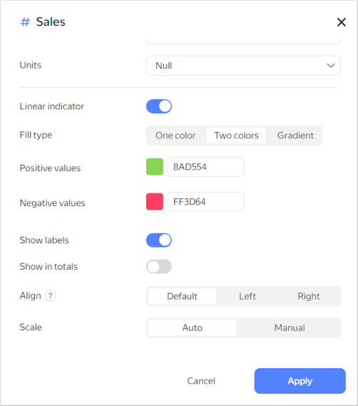
-
Click Apply.
Recommendations
-
Use a pivot table to represent aggregate data in table format.
-
Place dimensions on the left and measures on the right. This makes the data easier to comprehend.
-
Make sure column names you use are short and readable.
-
Limit the size of your tables or use filters/sorting. Tables with too many rows or columns are hard to read.
-
You can color table cells depending on the values of a measure. This will help you to highlight the values.
-
Use tables for their intended purpose only. Do not replace all data visualization types with them.
-
When posting a table on a dashboard, enable auto height in the widget settings. This will help you save dashboard space.
Setting up auto height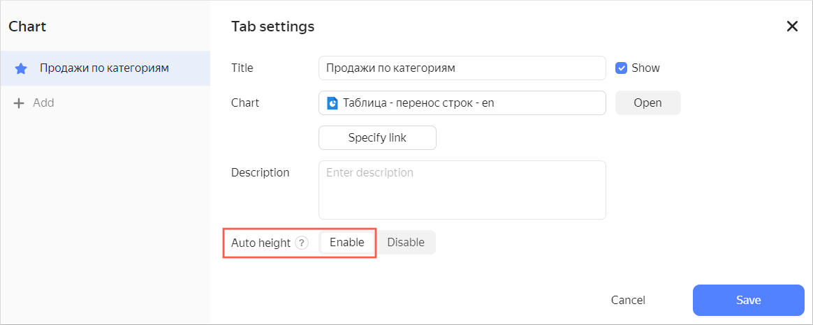
If you use a filter, the table height will automatically adapt to the number of rows.
Using a filter with the auto height option enabledIf no value is set in the filter, a table displays all rows depending on the limit to the number of rows per page.
If the number of displayed rows decreases when using the filter, the table height is reduced automatically.
-
Represent totals (or subtotals) as a column. To do this, use calculated fields based on window functions or LOD expressions. For example:
-
Subtotal amount of sales by product category: the
CategorySalesmeasure with the formulaSUM(SUM([Sales]) WITHIN [ProductCategory]). -
Total sales: the
TotalSalesmeasure with the formulaSUM(SUM([Sales]) TOTAL).Sample table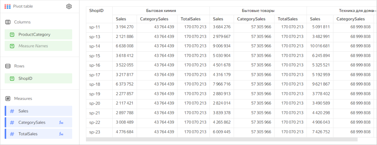
-
Maximum order count per month grouped by product category: the
MaxCountByCategorymeasure with the formulaMAX(COUNTD([OrderID] INCLUDE [ProductCategory])).Sample table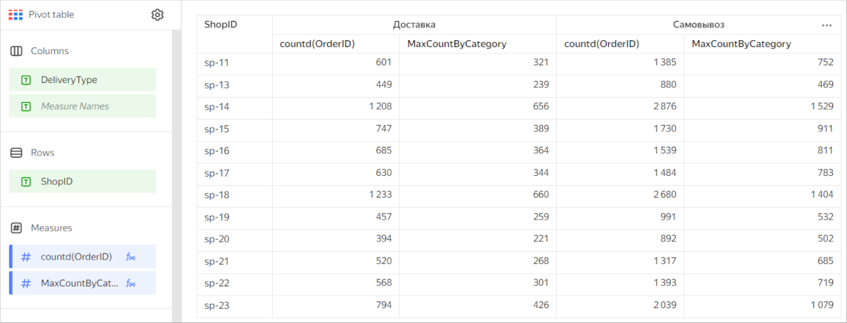
-
-
Use sorting. This makes the data easier to comprehend.
-
Use the URL function in table cells to enable users to follow a link.
-
When displaying numeric data, specify units and the number of decimal places. For example, if you select
Millions, Min the drop-down list of the Units field, the10.3 Mvalue is displayed instead of10,345,234.23. If you set thePrecisionfield value to2, then123.12is displayed instead of123.1234.