Visualizing data with a QL chart
In this scenario, you will create charts using SQL queries. SQL queries enable you to configure data for visualization in a more flexible way than the standard dataset method does. For example, you can add parameters from dashboards to a SQL query.
We recommend using a QL chart if creating a regular chart from a dataset is not suitable for your situation or if you wish to experiment with the data.
A direct connection to a demo database will be used as your data source.
To visualize and explore data, set up DataLens and follow the steps below:
- Create a connection.
- Create a QL chart.
- Create a dashboard.
- Add the QL chart to the dashboard.
- Add selectors to the dashboard.
Warning
SQL queries only work with databases. File, GoogleSheets, Yandex Metrica, and other service connections do not support SQL queries.
Getting started
To get started with DataLens:
-
Log in to your Yandex account.
-
Open the DataLens home page.
-
Click Open Datalens.
-
Select one of the options:
-
If you already have an organization, select it from the drop-down menu in the Organizations tab and click Open DataLens.
Note
To activate a DataLens instance, the user must have the
adminorownerrole. For more information about roles, see Access management in Yandex Cloud Organization. -
If you have a cloud but no organization, click Add new DataLens. In the window that opens, enter your organization's name and description and click Create organization and DataLens. For more information about working with organizations, see Getting started with organizations.
-
If you have a technical question about the service, please contact Yandex Cloud support. To ask for advice, discuss the solution to your problem or best practices of the service, write to the DataLens chat in Telegram.
Create a connection
Warning
If you use a new DataLens object model with workbooks and collections:
- Go to the DataLens home page. In the left-hand panel, select Collections and workbooks.
- Open the workbook, click Create in the top-right corner, and select the appropriate object.
Follow the guide from step 3.
-
Go to the connections page.
-
Click Create connection.
-
Select the ClickHouse connection.
-
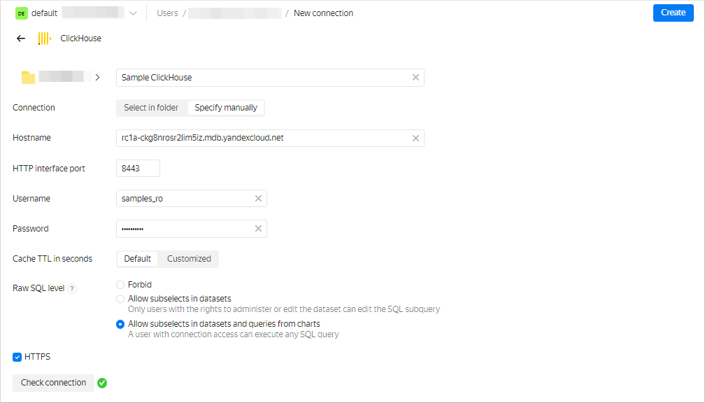
In the window that opens, specify the connection parameters:
- Connection type: Specify manually.
- Host name:
rc1a-ckg8nrosr2lim5iz.mdb.yandexcloud.net. - HTTP interface port:
8443(default). - Username:
samples_ro. - Password:
MsgfcjEhJk.
-
Enable Allow subqueries in datasets and queries from charts.
-
Check the connection and click Create connection.
-
Enter
Sample ClickHouseas your connection name. -
Click Create.
-
Wait for the connection to be saved.
Create a QL chart
-
Go to an existing database connection.
-
Make sure SQL query access level → Allow subqueries in datasets and queries from charts is enabled.
-
In the top right-hand corner, click Create QL chart.
-
On the Query tab, enter the query code:
SELECT toDate(t1.OrderDatetime) as "Date", COUNT(t1.ClientID) as "Number of new customers", t3.ClientStatus as "Status" FROM samples.MS_SalesFacts t1, (SELECT ClientID, MIN(OrderDatetime) as FirstDate FROM samples.MS_SalesFacts GROUP BY ClientID) as t2, samples.MS_Clients t3 WHERE {{interval_from}} < "Date" and "Date" < {{interval_to}} and t1.ClientID=t2.ClientID and t3.ClientID=t2.ClientID and t3.ClientStatus in {{status}} -- status, interval_from and interval_to - variables associated with parameters affected by selectors GROUP BY "Status", "Date" ORDER BY "Date" -
On the Parameters tab, click Add parameter and complete the input fields:
-
From the drop-down list, select
string(default). -
In the Name field, enter
status. -
In the Default value field, enter
Gold. -
Click Add value below and enter
Silver. -
Click Add value below and enter
Basic.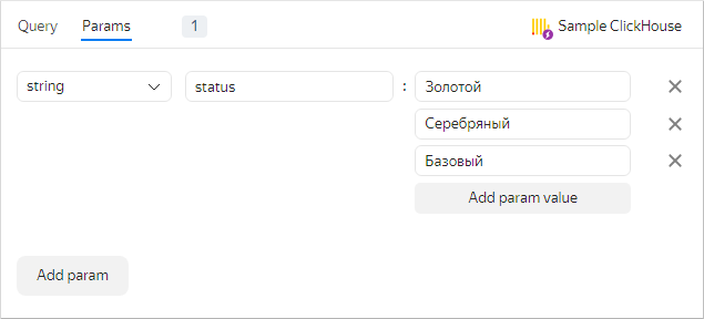
The added parameter will be associated with the
{{status}}variable in the query. -
-
Click Add parameter and complete the input fields:
-
In the drop-down list, select
date-interval. -
In the Name field, enter
interval. -
Click the field with the interval value and enter:
-
From:
2017-03-01. -
To:
2017-03-31.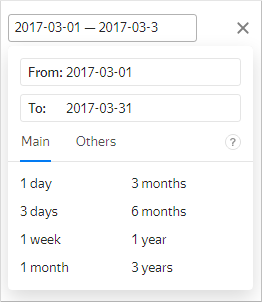
The From: and To: values of the added parameter will be bound to the
{{interval_from}}and the{{interval_to}}variables in the SQL query.Note
You can control the parameter values using dashboard selectors.
-
-
-
Go back to the Query tab. In the lower left-hand corner, click Start. Running the query will produce a visualization in the right-hand window.
-
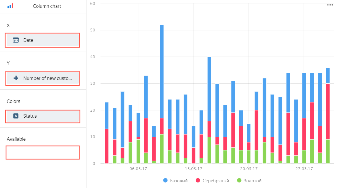
Configure the visualization:
-
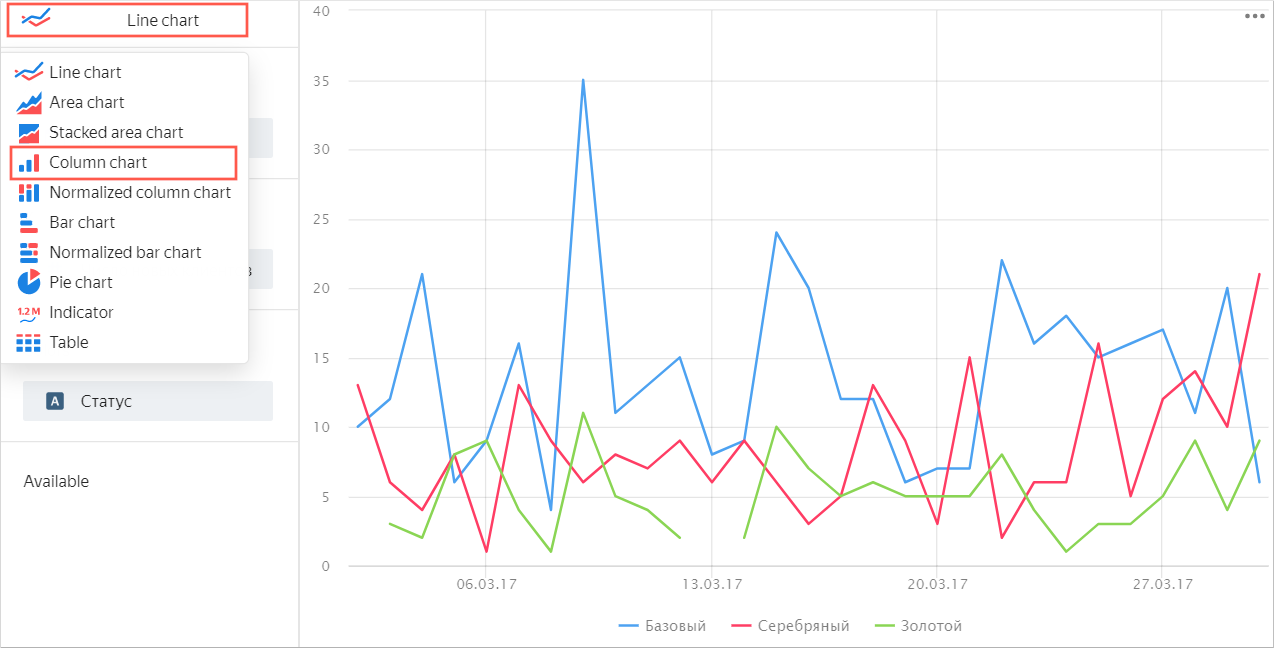
Select Bar chart as chart type.
-
Make sure that the Date field is in the X section.
-
Make sure that the Number of new clients field is in the Y section.
-
Make sure that the Status field is in the Colors section.
-
Make sure the Available section is empty. This is the section that contains fields not involved in calculations. Otherwise, the visualization will display incorrectly.
-
-
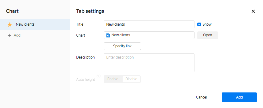
In the top-right corner, click Save.
-
Enter
New clientsas your chart name and click Save.
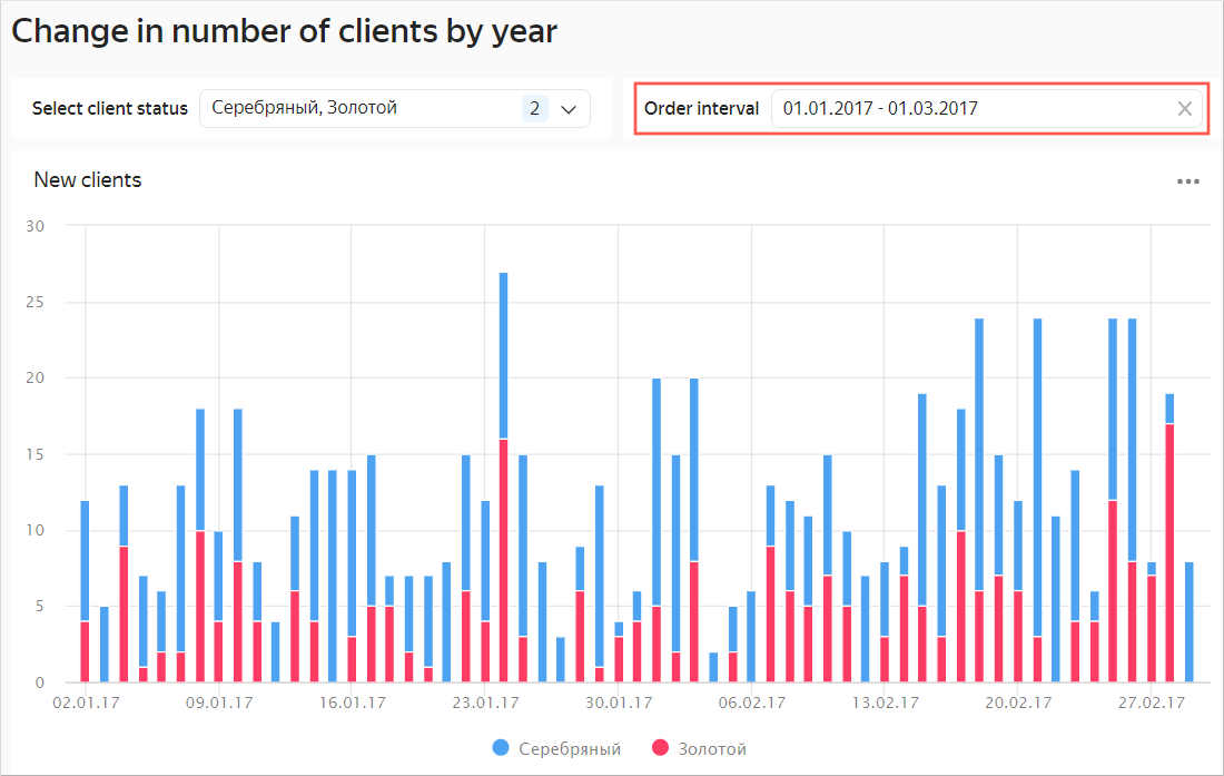
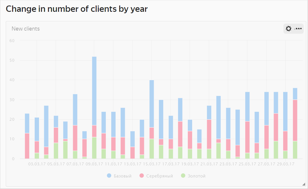
You can place the chart created on the dashboard. You can also equip the dashboard with selectors to control the values of the QL chart status and interval parameters.
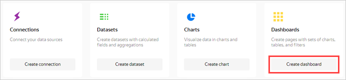
Create a dashboard
Create a dashboard to add these charts to.
-
Go to the DataLens home page.
-
Click Create dashboard.
Add the QL chart to the dashboard
-
At the top of the page, click Add and select Chart.
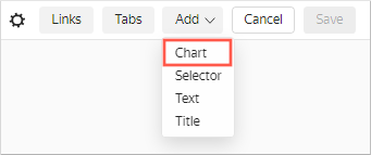
-
In the Chart field, click Select and select the previously created New clients chart from the chart list.
Click Add.
-
The chart is displayed on the dashboard. Stretch it to improve visualization.
Add selectors to the dashboard
-
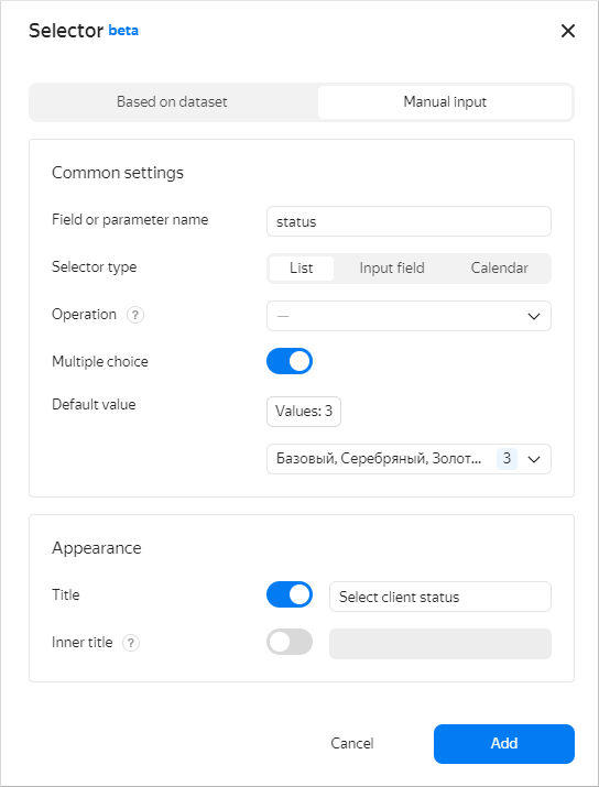
Add a selector to be able to filter the chart by client status:
-
At the top of the page, click Add.
-
Choose Selector.
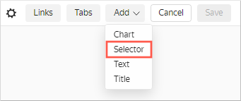
-
Select Manual input as the source type.
-
In the Field name field, enter
status. Certain selector values will be passed into this SQL query variable. -
Choose List as your selector type.
-
Enable the Multiple choice option.
-
Click the input field next to the Default value parameter. In the resulting window, add the following values:
- Gold
- Silver
- Basic
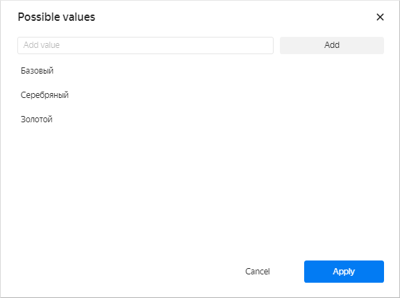
Click Apply.
-
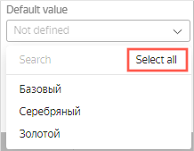
In the Default value list, specify Select all.
-
Enable the Name option and enter
Select client status. -
Verify the specified selector parameters.
-
Click Add.
-
Place the selector on the dashboard under the chart.
-
-
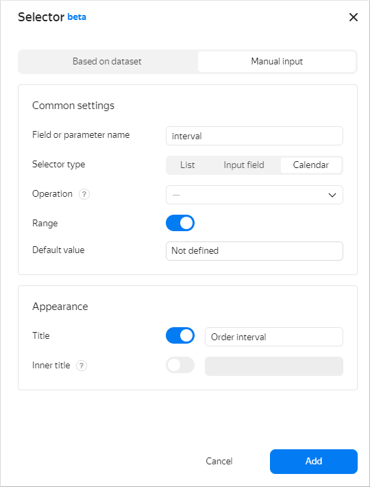
Add another selector to be able to filter the chart based on a date range:
-
At the top of the page, click Add.
-
Choose Selector.
-
Select Manual input as the source type.
-
Under Field name, enter
interval. The interval start and end values from the selector will be passed into the SQL query{{interval_from}}and the{{interval_to}}variables. -
Choose Calendar as your selector type.
-
Enable Range.
-
Enable the Name option and enter
Order interval. -
Verify the specified selector parameters.
-
Click Add.
-
Place the selector on the dashboard on top of the chart next to the first selector.
-
In the top-right corner of the dashboard, click Save.
-
Enter
Change in number of clients by yearas the dashboard name and click Create.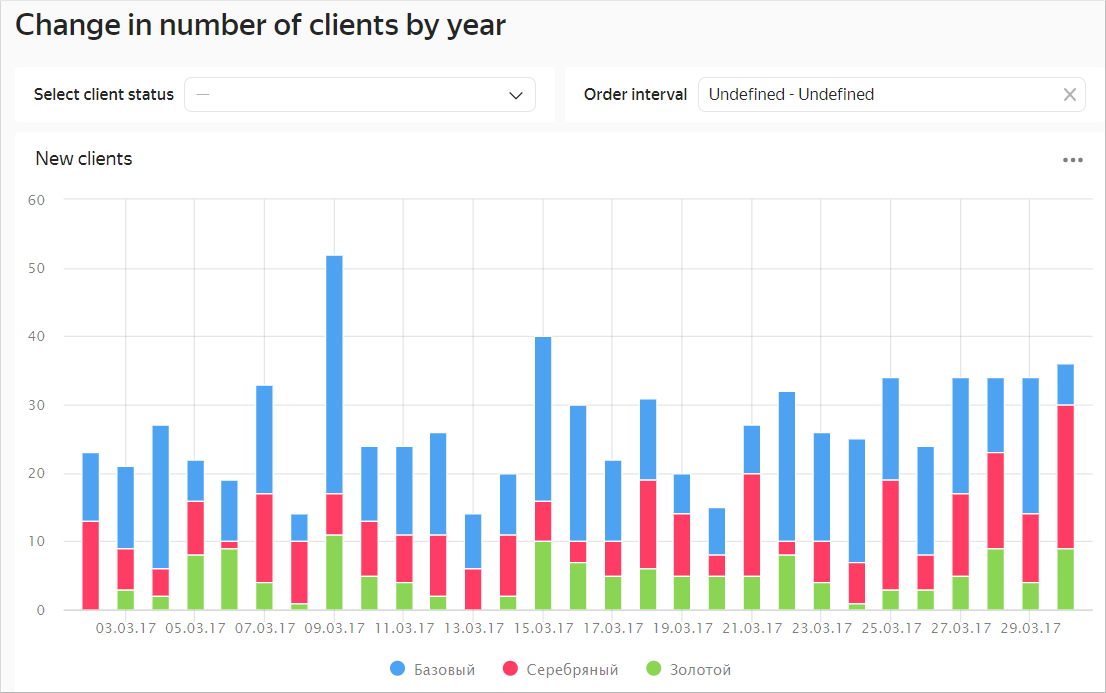
-
-
Your dashboard is ready. Now you can filter the chart by status using a selector.
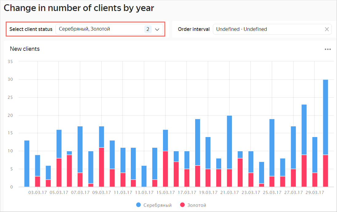
You can also filter the chart by a date range using the second selector.