Getting started with DataLens
In this tutorial, you will create your first dataset, build several charts to visualize data, and place them on a dashboard.
To get started with DataLens:
-
Log in to your Yandex account.
-
Open the DataLens home page.
-
Click Open Datalens.
-
Select one of the options:
-
If you already have an organization, select it from the drop-down menu in the Organizations tab and click Open DataLens.
Note
To activate a DataLens instance, the user must have the
adminorownerrole. For more information about roles, see Access management in Yandex Cloud Organization. -
If you have a cloud but no organization, click Add new DataLens. In the window that opens, enter your organization's name and description and click Create organization and DataLens. For more information about working with organizations, see Getting started with organizations.
-
If you have a technical question about the service, please contact Yandex Cloud support. To ask for advice, discuss the solution to your problem or best practices of the service, write to the DataLens chat in Telegram.
Create a connection
Warning
If you use a new DataLens object model with workbooks and collections:
- Go to the DataLens home page. In the left-hand panel, select Collections and workbooks.
- Open the workbook, click Create in the top-right corner, and select the appropriate object.
Follow the guide from step 3.
-
Go to the connections page.
-
Click Create connection.
-
Select the ClickHouse connection.
-
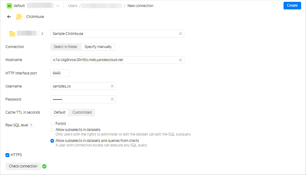
In the window that opens, specify the connection parameters:
- Connection type: Specify manually.
- Host name:
rc1a-ckg8nrosr2lim5iz.mdb.yandexcloud.net. - HTTP interface port:
8443(default). - Username:
samples_ro. - Password:
MsgfcjEhJk.
-
Enable Allow subqueries in datasets and queries from charts.
-
Check the connection and click Create connection.
-
Enter
Sample ClickHouseas your connection name. -
Click Create.
-
Wait for the connection to be saved.
Create a dataset
-
In the top-right corner, click Create dataset.
-
Drag the
MS_SalesMiniTabletable to the workspace.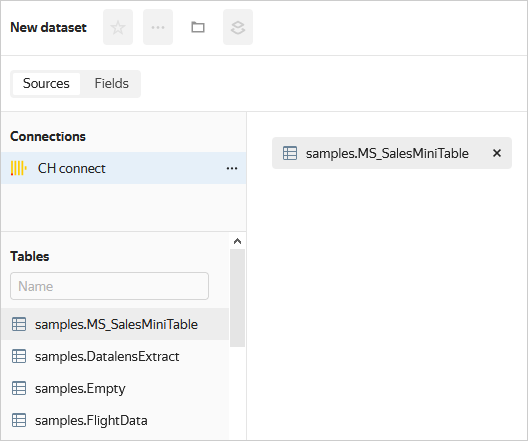
-
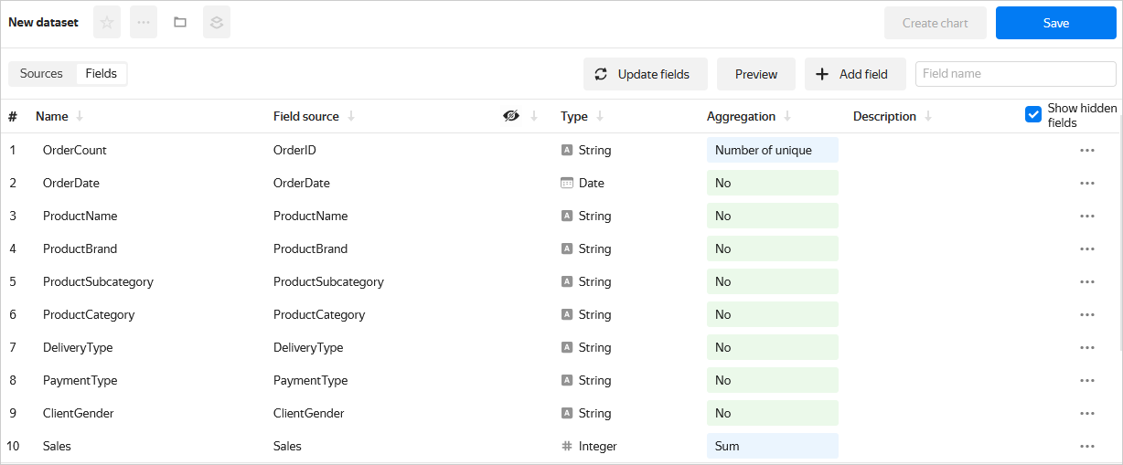
Go to the Fields tab.
-
In the Aggregation column, select Sum for the
Salesfield. -
Create a measure for the number of orders:
- Rename the
OrderIDfield toOrderCount. - Change the aggregation type to Number of unique.
- Rename the
-
For the
ShopAddressCoordfield, change the data type to Geopoint. -
Save the dataset:
- In the top-right corner, click Save.
- Enter a name for the dataset and click Create.
Create a column chart
-
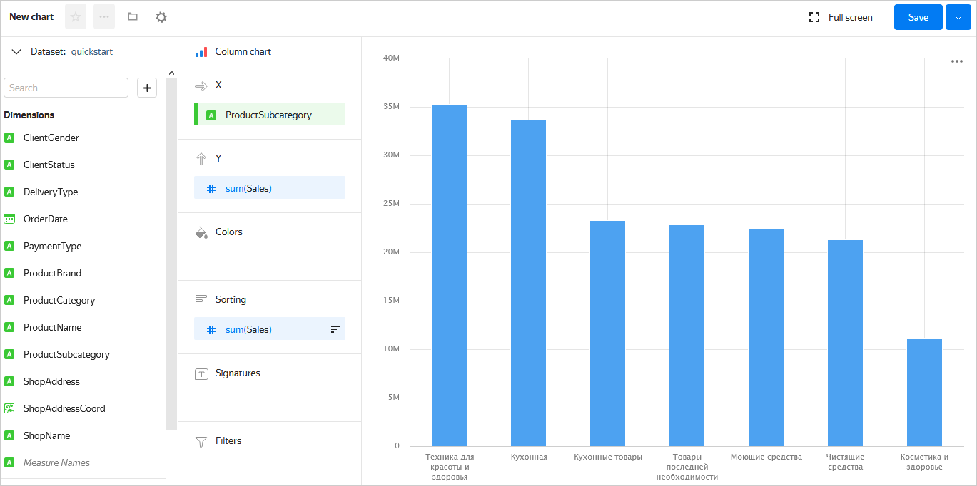
In the top-right corner, click Create chart.
-
Select the Bar chart visualization type.
-
Add the product subcategory to the chart. To do this, drag the
ProductSubcategoryfield from Dimensions to the X section. -
Add a sales measure to the chart. To do this, drag the
Salesfield from Measures to the Y section. -
Sort the chart in descending order by sales by dragging the
Salesfield from Measures to the Sorting section. -
Save the chart:
- In the top-right corner, click Save.
- In the window that opens, enter the Sales by subcategory name for the chart and click Save.
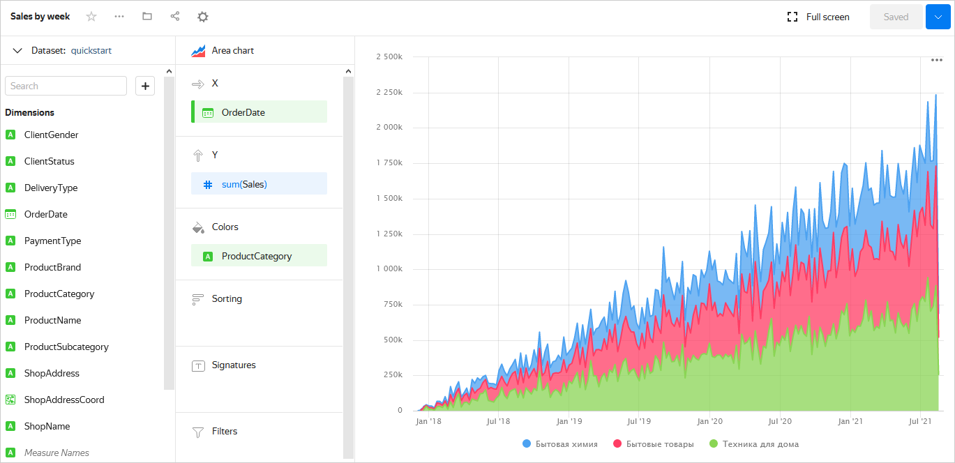
Create a stacked area chart
-
In the chart you created in the previous step, select Stacked area chart for the visualization type.
-
Replace the product subcategories with the order date on the X-axis. To do this, drag the
OrderDatefield from Dimensions to the X section and hold it over theProductSubcategoryfield until it turns red. -
Add the product category to the chart. To do this, drag the
ProductCategoryfield from Dimensions to the Colors section. -
Display a week by week chart:
- Click the calendar icon next to the
OrderDatefield in the X section. - In the Grouping field, select Rounding → Week.
- Click Apply.
- Click the calendar icon next to the
-
Save the chart:
- In the top-right corner, click → Save as copy.
- In the window that opens, enter the Sales by week name for the new chart and click Save.
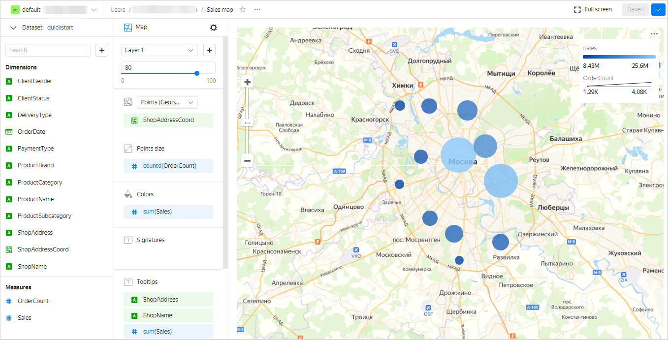
Create a map
-
In the chart you created in the previous step, select Map for the visualization type.
-
Add the coordinates of the points of sale to the map. To do this, drag the
ShopAddressCoordfield from Dimensions to the Points (Geopoints) section. -
Change the point size based on the number of orders. To do this, drag the
OrderCountfield from Measures to the Point size section. -
Change the point color based on the sales measure. To do this, drag the
Salesfield from Measures to the Colors section. -
Add the following fields to the Tooltips section:
ShopAddressShopNameSalesOrderCount
-
Save the chart:
- In the top-right corner, click → Save as copy.
- In the window that opens, enter the Sales map name for the new chart and click Save.
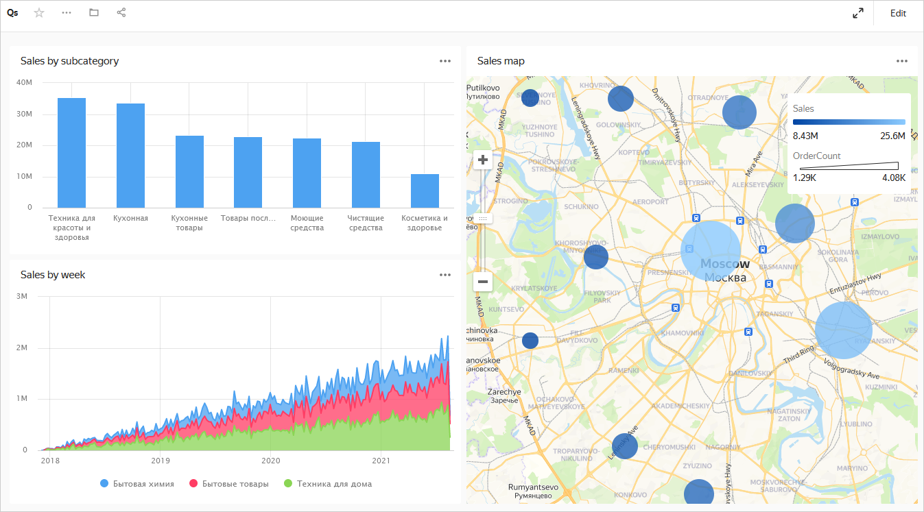
Create a dashboard and add charts to it
-
Go to the DataLens home page.
-
In the left-hand panel, click Dashboards.
-
Click Create dashboard.
-
In the panel at the bottom of the page, select Chart.
-
In the window that opens, click Select.
-
Select the Sales map chart. This will automatically fill in the Name field.
-
Click Add.
-
Repeat the steps to add the Sales by subcategory and the Sales by week charts.
-
Position the charts on the dashboard however you like.
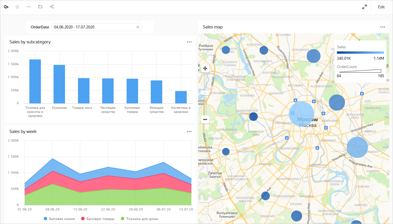
Add a selector to the dashboard
-
In the panel at the bottom of the page, choose Selector.
-
Add the calendar selector for the order date:
- Select the created dataset.
- Select the
OrderDatefield. This will automatically fill in the Name field. - Enable Range.
- Click Add.
-
Position the selector on the dashboard wherever you like.
-
Save the dashboard:
- In the top-right corner of the dashboard, click Save.
- Enter a name for the dashboard and click Create.
What's next
- See the guides with service usage examples.
- Read about service concepts.
- View an example of a ready-to-use dashboard.
ClickHouse® is a registered trademark of ClickHouse, Inc.