Pie chart
Written by
Updated at May 6, 2024
This chart shows a proportional relationship of different categories to a total using circle segments (sectors). The entire circle area is 100% and corresponds to the sum of all categories. The area of each segment corresponds to the percentage of a category in the total amount. Pie charts are a good choice for demonstrating proportions of a small number of segments.
Source table
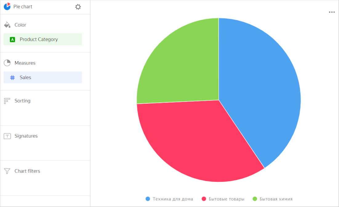
| Product categories | Sales |
|---|---|
| Home appliances | 69M |
| Household goods | 57M |
| Household cleaners | 44M |
Wizard sections
| Wizard section |
Description |
|---|---|
| Color | Dimension. You can only specify one field here. |
| Measures | Measure. You can only specify one field here. |
| Sorting | Measure or dimension from the Color section. Affects area sorting. The sorting direction is marked with an icon next to the field: for ascending or for descending. To change the sorting direction, click the icon. |
| Labels | Measure. Displays measure values on the chart. To add callouts with category names to the chart, drag the Measure Names dimension to this section. |
| Filters | Dimension or measure. Used as a filter. |
Creating a pie chart
To create a pie chart:
Warning
If you use a new DataLens object model with workbooks and collections:
- Go to the DataLens home page. In the left-hand panel, select Collections and workbooks.
- Open the workbook, click Create in the top-right corner, and select the appropriate object.
Follow the guide from step 4.
- Go to the DataLens home page.
- In the left-hand panel, select Charts.
- Click Create chart → Chart.
- At the top left, click Select dataset and specify the dataset to visualize.
- Select Pie chart as the chart type.
- Drag a dimension from the dataset to the Color section.
- Drag a measure from the dataset to the Measures section. The values will be displayed as pie chart areas.
Recommendations
- If there are more than 4-6 segments per chart, group the smallest of them as Other. A larger number of segments overloads a chart and makes it difficult to understand the data.
- You cannot display negative and null values on this type of chart.
- Do not use pie charts to show changes to proportions over time or for precisely comparing data by category.