Donut chart
Written by
Updated at January 18, 2024
This chart shows the proportion of different categories using donut segments. The sum of all segments is 100%. The size of each segment corresponds to the percentage of a category in the total amount. A number in the center of a ring depends on the selected measure and indicates the overall total. Donut charts are a good choice if you need to display a small number of segments.
Source table
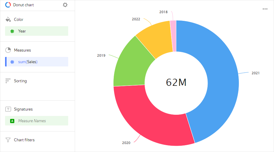
| Year | Sales |
|---|---|
| 2022 | 6M |
| 2021 | 28M |
| 2020 | 18M |
| 2019 | 9M |
| 2018 | 1M |
Sections in the wizard
| Wizard section | Description |
|---|---|
| Color | Dimension. You can only specify one field here. |
| Measures | Affects the size of donut segments. The total value of a measure is displayed in the center of a ring. You can only specify one field here. |
| Sorting | A measure or dimension from the Color section. Affects segment sorting. The sorting direction is marked with an icon next to the field: ascending or descending. To change the sorting direction, click the icon. |
| Labels | Measure. Displays measure values on the chart. To add callouts with category names to the chart, drag the Measure Names dimension to this section. |
| Filters | Dimension or measure. Used as a filter. |
Creating a donut chart
To create a donut chart:
- On the Yandex DataLens home page, click Create chart.
- Under Dataset, select a dataset for visualization.
- Select Donut chart as the chart type.
- Drag a dimension or measure from the dataset to the Color section.
- Drag a measure from the dataset to the Measures section. The values are displayed as donut chart segments.
To disable displaying a number in the center:
- In the top-left part of the screen, click .
- In the Chart settings window, disable the Results option.
- Click Apply.
Recommendations
- If there are more than 4-6 segments per chart, group the smallest of them as Other. A larger number of segments overloads a chart and makes it difficult to understand the data.
- You cannot display negative and null values on this type of chart.
- Do not use donut charts to show changes to proportions over time or for precisely comparing data by category.