Yandex Cloud
  • Services
  • Solutions
  • Why Yandex Cloud
  • Blog
  • Pricing
  • Documentation
  • Contact us
Get started
Language / Region
Yandex project
© 2023 Yandex.Cloud LLC
Yandex DataLens
  • Getting started
  • Practical guidelines
    • All tutorials
    • Visualizing data from a CSV file
    • Creating and publishing a chart with a map of Moscow from a CSV file
    • Analyzing a retail chain's sales from a ClickHouse database
    • Analyzing public data on road accidents in Russia
    • Analyzing sales and locations of pizzerias based on data from ClickHouse DB and Marketplace
    • Web analytics with a connection to Yandex Metrica
    • Web analytics with funnels and cohorts calculated based on Yandex Metrica data
    • Mobile app analytics based on AppMetrica data
    • Analyzing Yandex Music podcast statistics (for podcasters)
    • Visualizing data with a QL chart
    • Visualizing data using parameters
    • Visualizing Yandex Monitoring data
    • Building customer journey charts based on AppMetrica data
  • Concepts
    • Service overview
    • Organizations in DataLens
    • Connection
    • Data types
    • Datasets
      • Overview
      • Data model
      • Dataset settings
    • Charts
      • Overview
      • Chart settings
      • Measure Values and Measure Names
    • Dashboards
    • Joining data
    • Using Markdown in DataLens
    • DataLens Public
    • Calculated fields
      • Overview
      • Formula syntax
    • Parameterization
    • Marketplace
    • Backups
    • Caching
    • Quotas and limits
  • Step-by-step instructions
    • All instructions
    • Working with connections
      • Creating a ClickHouse connection
      • Creating a connection to a file
      • Creating a Google Sheets connection
      • Creating a MySQL connection
      • Creating a PostgreSQL connection
      • Creating a SQL Server connection
      • Creating a BigQuery connection
      • Creating an Oracle Database connection
      • Creating a YDB connection
      • Creating a Greenplum® connection
      • Creating a Prometheus connection
      • Creating a Yandex Monitoring connection
      • Creating a Yandex Metrica API connection
      • Creating an AppMetrica connection
      • Creating a Yandex Cloud Billing connection
      • Managing connection access
    • Working with datasets
      • Creating a dataset
      • Combining data from multiple tables
      • Creating a data field
      • Creating a calculated data field
      • Creating a default filter for new charts
      • Updating fields in datasets
      • Describing a dataset via a source SQL query
      • Managing dataset access
      • Managing access to data rows
      • Adding parameters to a dataset
    • Working with charts
      • Creating a chart
      • Creating a QL chart
      • Creating a multi-dataset chart
      • Adding a hierarchy
      • Configuring the navigator
      • Publishing a chart
      • Managing chart access
      • Adding ID as a parameter
      • Adding parameters to a chart
      • Configuring the display of null values
    • Working with dashboards
      • Creating dashboards
      • Adding charts to dashboards
      • Adding selectors to dashboards
      • Creating an alias
      • Deleting an alias field
      • Publishing dashboards
      • Managing dashboard access
      • Adding parameters to a dashboard
      • Dashboard auto-update
      • Widget display order on a mobile device
    • Working with permissions
      • Granting permissions
      • Deleting permissions
      • Request permissions
    • Working with DataLens Marketplace
      • Adding a product from Marketplace
      • Removing a product from Marketplace
      • Creating and connecting a connector (for partners)
    • Working with organizations
      • Switching between DataLens instances
  • Access management
    • Managing access to DataLens
    • Managing access at the data row level
  • Pricing policy
  • Visualization reference
    • All visualizations
    • Line chart
    • Stacked area chart
    • Normalized stacked area chart
    • Column chart
    • Normalized column chart
    • Bar chart
    • Normalized bar chart
    • Scatter chart
    • Pie chart
    • Indicator
    • Tree chart
    • Donut chart
    • Table
    • Pivot table
    • Map
      • Overview
      • Point map
      • Point map with clusters
      • Polyline map
      • Choropleth map
      • Heat map
    • Combined chart
  • Function reference
    • All Functions
    • Aggregate functions
      • Overview
      • ALL_CONCAT
      • ANY
      • ARG_MAX
      • ARG_MIN
      • AVG
      • AVG_IF
      • COUNT
      • COUNTD
      • COUNTD_APPROX
      • COUNTD_IF
      • COUNT_IF
      • MAX
      • MEDIAN
      • MIN
      • QUANTILE
      • QUANTILE_APPROX
      • STDEV
      • STDEVP
      • SUM
      • SUM_IF
      • TOP_CONCAT
      • VAR
      • VARP
    • Array functions
      • Overview
      • ARRAY
      • ARR_AVG
      • ARR_MAX
      • ARR_MIN
      • ARR_PRODUCT
      • ARR_REMOVE
      • ARR_STR
      • ARR_SUM
      • CAST_ARR_FLOAT
      • CAST_ARR_INT
      • CAST_ARR_STR
      • CONTAINS
      • COUNT_ITEM
      • GET_ITEM
      • REPLACE
      • SLICE
      • STARTSWITH
      • UNNEST
    • Date/Time functions
      • Overview
      • DATEADD
      • DATEPART
      • DATETRUNC
      • DAY
      • DAYOFWEEK
      • HOUR
      • MINUTE
      • MONTH
      • NOW
      • QUARTER
      • SECOND
      • TODAY
      • WEEK
      • YEAR
    • Logical functions
      • Overview
      • CASE
      • IF
      • IFNULL
      • ISNULL
      • ZN
    • Mathematical functions
      • Overview
      • ABS
      • ACOS
      • ASIN
      • ATAN
      • ATAN2
      • CEILING
      • COMPARE
      • COS
      • COT
      • DEGREES
      • DIV
      • EXP
      • FLOOR
      • GREATEST
      • LEAST
      • LN
      • LOG
      • LOG10
      • PI
      • POWER
      • RADIANS
      • ROUND
      • SIGN
      • SIN
      • SQRT
      • SQUARE
      • TAN
    • Operators
      • Overview
      • AND
      • Addition and concatenation (+)
      • BETWEEN
      • Comparison
      • Division (/)
      • IN
      • IS FALSE
      • IS TRUE
      • LIKE
      • Modulo (%)
      • Multiplication (*)
      • NOT
      • Negation (-)
      • OR
      • Power (^)
      • Subtraction (-)
    • String functions
      • Overview
      • ASCII
      • CHAR
      • CONCAT
      • CONTAINS
      • ENDSWITH
      • FIND
      • ICONTAINS
      • IENDSWITH
      • ISTARTSWITH
      • LEFT
      • LEN
      • LOWER
      • LTRIM
      • REGEXP_EXTRACT
      • REGEXP_EXTRACT_NTH
      • REGEXP_MATCH
      • REGEXP_REPLACE
      • REPLACE
      • RIGHT
      • RTRIM
      • SPACE
      • SPLIT
      • STARTSWITH
      • SUBSTR
      • TRIM
      • UPPER
      • UTF8
    • Text markup functions
      • Overview
      • BOLD
      • ITALIC
      • MARKUP
      • URL
    • Time series functions
      • Overview
      • AGO
      • AT_DATE
    • Type conversion functions
      • Overview
      • BOOL
      • DATE
      • DATETIME
      • DATETIME_PARSE
      • DATE_PARSE
      • DB_CAST
      • FLOAT
      • GEOPOINT
      • GEOPOLYGON
      • INT
      • STR
    • Window functions
      • Overview
      • AVG
      • AVG_IF
      • COUNT
      • COUNT_IF
      • FIRST
      • LAG
      • LAST
      • MAVG
      • MAX
      • MCOUNT
      • MIN
      • MMAX
      • MMIN
      • MSUM
      • RANK
      • RANK_DENSE
      • RANK_PERCENTILE
      • RANK_UNIQUE
      • RAVG
      • RCOUNT
      • RMAX
      • RMIN
      • RSUM
      • SUM
      • SUM_IF
    • Function Availability
  • Function tutorials
    • Aggregate functions
    • Window functions
    • LOD expressions and filtering in aggregate functions
  • Public materials
    • Educational projects
    • Webinars and conferences
    • Articles and publications
    • Public dashboards and charts
  • Troubleshooting
    • Questions and answers
    • DataLens errors
  1. Visualization reference
  2. Scatter chart

Scatter chart

Written by
Yandex Cloud
  • Sections in the wizard
  • Creating a scatter chart
    • Configuring the display of nullvalues
  • Recommendations

A scatter chart shows the relationship between two values (dimensions or measures). Their values are represented as points. A scatter chart always has two axes: the values of one dimension or measure are plotted along the X-axis and those of the other along the Y-axis. A data point that links these two values is displayed at the intersection of the X and Y coordinates. These data points can be distributed along the X-axis evenly or unevenly, depending on specific data.

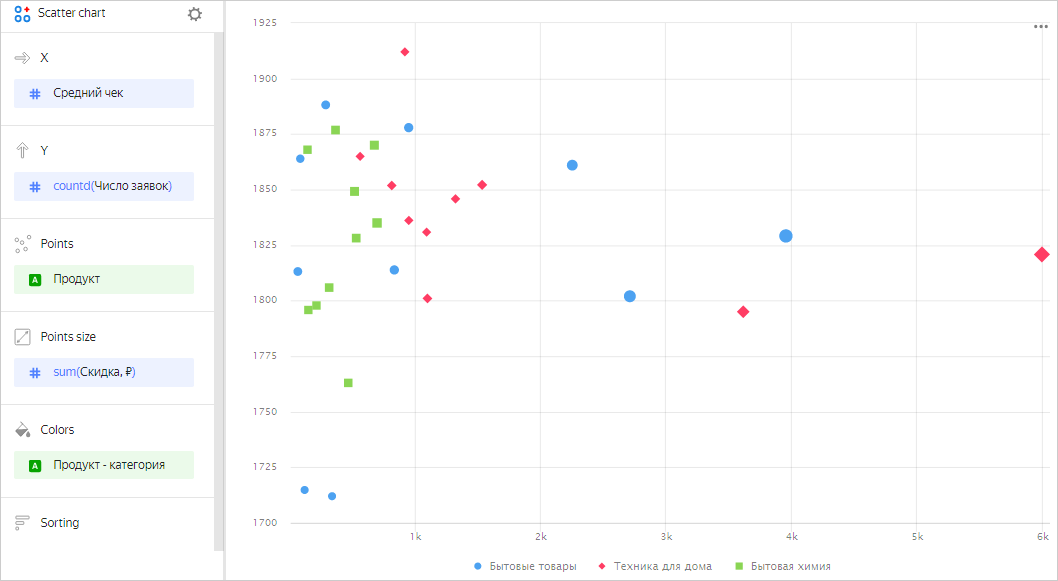
Use this type of chart if you need to find the dependency between dimensions and measures or show a range of values. For example, the relationship between the average order value and the number of orders for a product.

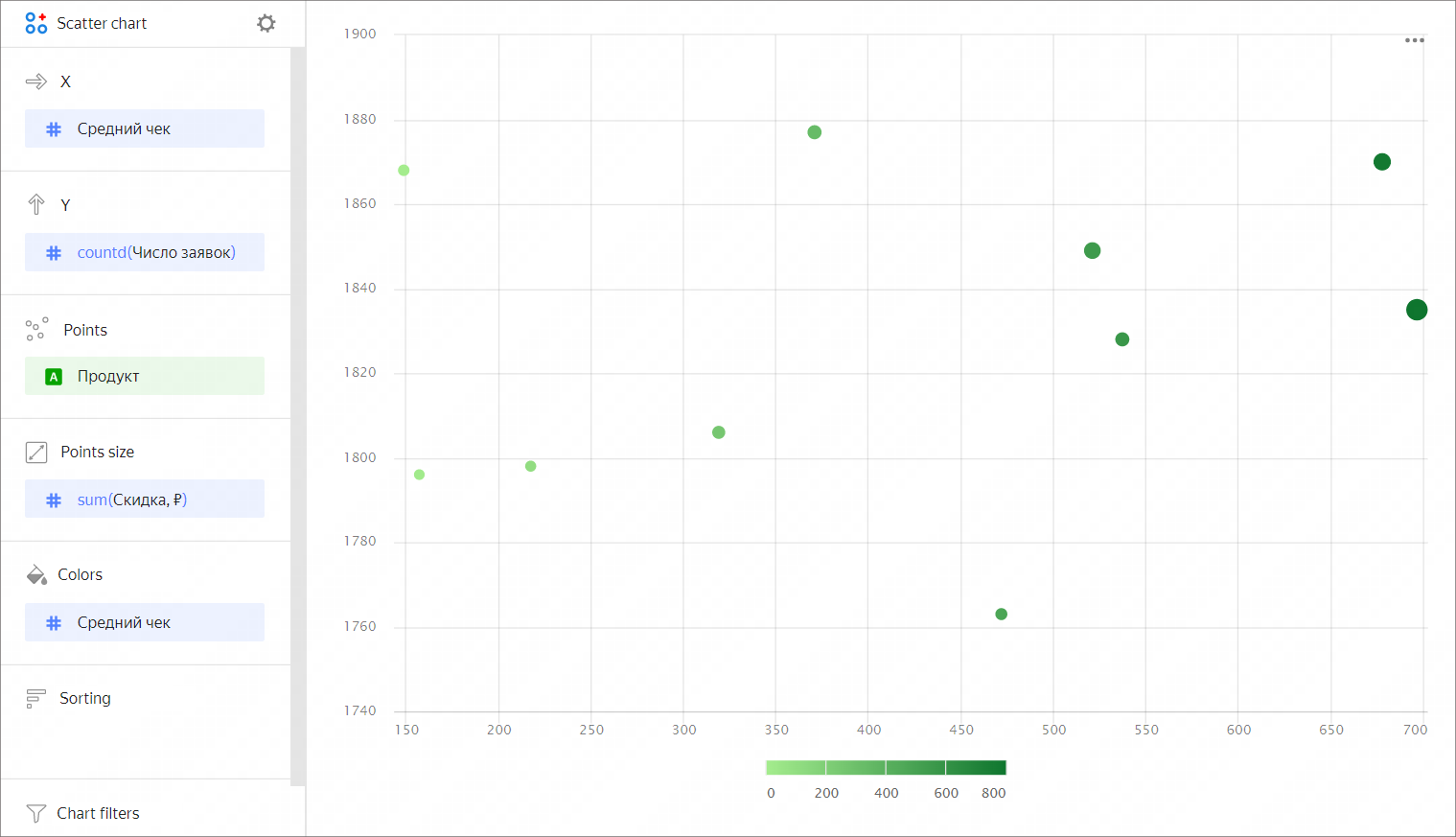
You can also represent dependencies on a scatter chart using point sizes. The size of a point depends on the measure value: the higher the value, the larger the point size. For example, the size of a point may depend on the discount on a product.

scatter-chart

A slice of two rows from the source table
Product Category Average order value Number of orders Discount
Floor cleaner liquid Household cleaners 153.0 1 0
Multicooker with 40 modes Home appliances 3442.0 1 0
Liquid detergent for colored clothes Household cleaners 525.0 1 0
Carpet detergent Household cleaners 463.0 1 0
Lemon dishwashing liquid Household cleaners 362.0 1 0

The dataset is built on Sample ClickHouse connection tables.

You can use a gradient in a chart by adding a measure to the Colors section. For example, the higher the average order value for a product, the darker the point shade.

scatter-chart

Sections in the wizard

Section
in the wizard
Description
X Dimension or measure. Sets the X-axis value.
Y Dimension or measure. Sets the Y-axis value.
Points Dimension. Specifies the number of points on the chart.
Points size Measure. Sets a point size depending on the measure value.
Colors Dimension or measure. Affects the color of points.
Sorting Dimension. Can only use a dimension from the X-axis. Affects the sorting of the X-axis.
Chart filters Dimension or measure. Used as a filter.

Creating a scatter chart

To create a scatter chart:

  1. On the Yandex DataLens home page, click Create chart.
  2. Under Dataset, select a dataset for visualization. If you don't have a dataset, create one.
  3. Select Scatter chart as the chart type.
  4. Drag a dimension from the dataset to the X section.
  5. Drag one or more measures from the dataset to the Y section. The values will be represented as points at the intersection of the X and Y coordinates.

You can also:

  1. Change the color of points:

    1. Drag a dimension or measure from the dataset to the Colors section.
    2. Click and set new colors.
  2. Specify an additional dimension. To do this, drag a dimension to the Points section.

Configuring the display of nullvalues

If the source data includes a row where the measure value is null, this point won't be shown on the chart at default settings. For example, if the source includes a row with a date (20.07.2022) but the sales amount is missing for it.

You can use settings for chart sections to show null values:

  1. In the section with a measure whose values you want to show, in the upper-right corner, click (the icon appears when you hover over the section).
  2. In Empty values (null), select Display as 0.
  3. Click Apply.

Now, the chart will use 0 instead of null.

If a row is missing in the source data, the chart section settings won't affect the measure display on the chart. For example, if the source data doesn't have a row with a certain date (20.07.2022), nothing will be shown for this date on the chart.

For more information, see Configuring the display of null values.

Recommendations

  • If the values of the categories contain a large amount of text, try to reduce it. Then the signatures on the diagram will look more accurate. You can use string functions in the calculated fields or conditional operators CASE.

  • The axis scale often varies and may start with a value other than 0. Pay attention to value signatures.
  • A scatter chart isn't suitable for visualization of data over time.
  • When visualizing multiple measures, select colors carefully. They should be distinguishable and contrasting.

Was the article helpful?

Language / Region
Yandex project
© 2023 Yandex.Cloud LLC
In this article:
  • Sections in the wizard
  • Creating a scatter chart
  • Configuring the display of nullvalues
  • Recommendations