Map

Maps are used for geoanalytics: displaying and analyzing business indicators on a map. These indicators may include population and population density, the number of commercial facilities and their profit, and other parameters that may affect the efficiency of a business.
You can use a map to display layers of different types:
- Areas. A layer indicates entire areas or regions. Measure values are represented using colors or color shades. It's a good practice to add pop-up hints with area names or measures to a map.
- Points. Points can be used to display individual objects like cities, stores, order pickup points, or customer addresses. Measure values can be indicated in two ways: through a point color and its size.
- Lines. Lines are used to show links between objects in the area. For example, airline flights or cargo transportation routes.
- Heatmap. Shows the density of points on a map. It is helpful when you need to display a large number of points and their concentration areas.
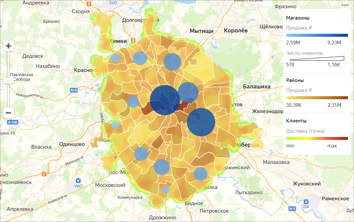
To create maps, make sure the data source contains either Geopoint coordinates or Geopolygon areas.
You can place no more than 5 layers with any visualization type on a map. Layers in the Map chart are called geolayers.
Geolayers visualize indicators using points or polygons on the map.
You can do the following operations with geolayers:
- Change name.
- Set the transparency level using the slider.
- Reorder the layers inside a visualization type. However, you cannot change the order of visualization types (top-to-bottom: point map, polyline map, chloropleth map, and heat map).
You can purchase pre-calculated geolayers from partners in Cloud Marketplace.
Note
You cannot create maps in QL charts.