Polyline map
Written by
Updated at October 6, 2023
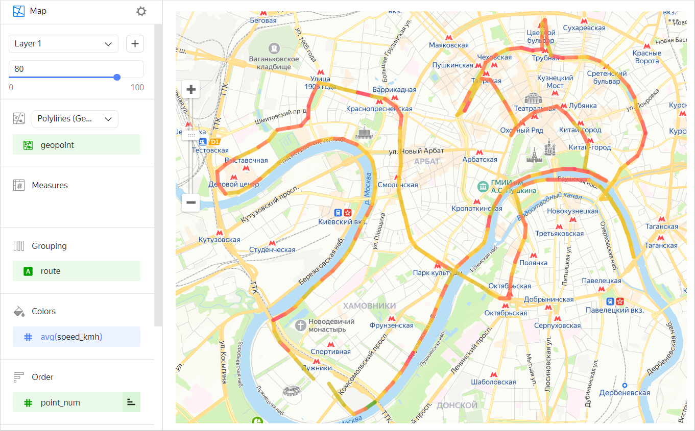
A polyline map is a type of geolayer on a Map chart that lets you draw polylines on the map. A polyline consists of points connected in a certain order. A polyline map is used, for example, to show the path of a moving object.
To build a polyline map, you need the following data:
- Coordinates of line points of the Geopoint data type. Each point of each polyline must be stored in a dataset as a separate row.
- A field or a set of fields to group points into lines (each line's ID).
- A field to sort the order of points in each line (such as a timestamp or point number).
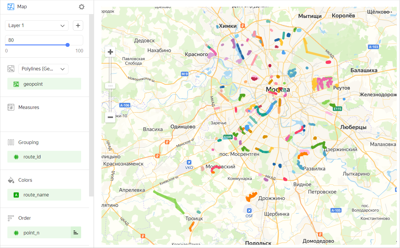
You can color polyline segments in one of the following ways:
-
In a gradient by measure (for a example, an average speed in a point).
-
In discrete colors by dimension (for example, by trip name).
Sections in the wizard
| Section in the wizard |
Description |
|---|---|
| Polylines (Geopoints) | Measure with the type Geopoint. |
| Measures | Measure. The value displayed when you hover over a point. |
| Grouping | Dimension. Defines a group of points forming a polyline. |
| Colors | Dimension or measure. Affects the intensity of line segment fill. A segment is filled in from the originating point. |
| Order | Dimension. Defines the order for connecting points within a group. |
| Layer filters | Dimension or measure. Used as a filter for the current layer. |
| Filters | Dimension or measure. Used as a filter for the entire chart. |
Creating a polyline map
To create a polyline map:
- On the Yandex DataLens home page, click Create chart.
- Under Dataset, select a dataset for visualization.
- Select the Map chart type.
- Select the Polylines (Geopoints) layer type.
- Drag a dimension with the Geopoint type from the dataset to the layer type selection section.
- Specify a group of points that defines polylines. Move the measure to the Grouping section.
- Define the order for connecting points within the group. Move the measure to the Order section.
- Color the line on the map. Move the measure or dimension to the Colors section.
You can also:
- Add, rename, and delete a layer.
- Apply a filter to the whole chart or one layer.
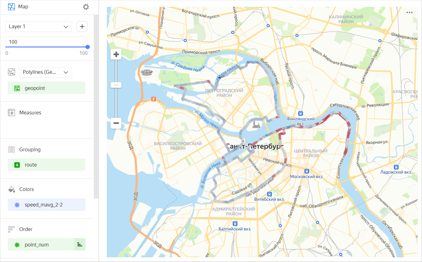
Recommendations
- Reduce the number of route points at the source level if there are too many of them. To do this, use a chart-level filter. This will speed up map loading and rendering.
- Use the MAVG moving average function to smooth measure outliers of individual points/sections. For example, when building a line to represent the average speed using the
MAVG([speed],2,2)function, the speed measure values are averaged in the current, two previous, and two subsequent points. As a result, the color gradient changes more smoothly.